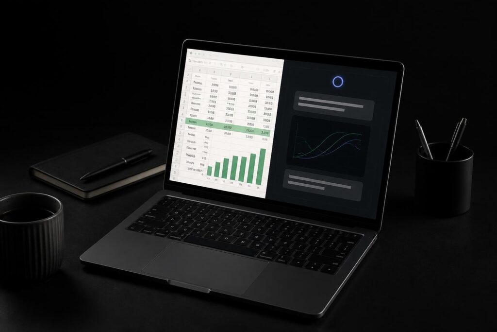
Excel dashboards have evolved dramatically with the integration of artificial intelligence, transforming how professionals visualize and interpret data. Understanding how to use AI for Excel dashboards empowers you to create dynamic, insightful reports that respond to your business needs in real time. Whether you're managing sales metrics, tracking project milestones, or analyzing financial performance, AI-powered tools can dramatically reduce the time you spend building and maintaining dashboards while improving their accuracy and interactivity.
The Fundamental Shift in Dashboard Creation
Traditional dashboard creation required hours of manual formatting, formula writing, and chart configuration. You needed deep Excel expertise to build pivot tables, create dynamic ranges, and connect multiple data sources into cohesive visualizations. AI has fundamentally changed this process by automating repetitive tasks and suggesting intelligent design choices based on your data patterns.
Modern AI tools analyze your spreadsheet structure, identify key metrics, and recommend appropriate visualization types without requiring you to understand complex charting principles. When you work with Microsoft Excel consulting professionals, they increasingly leverage these AI capabilities to deliver faster, more accurate results.
How AI Interprets Your Data
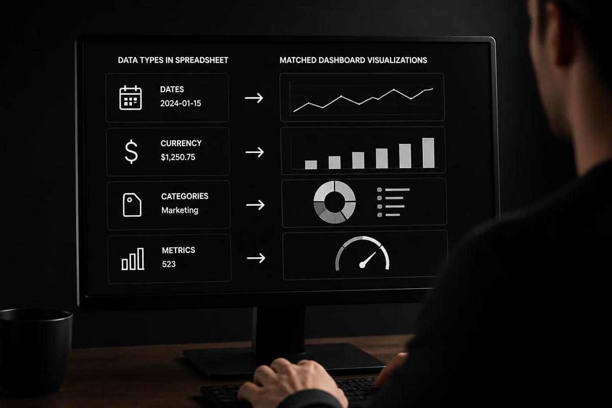
AI algorithms scan your Excel data to recognize patterns, relationships, and hierarchies automatically. When you upload a sales spreadsheet, AI identifies date columns, revenue figures, product categories, and regional breakdowns without manual tagging. This recognition capability enables the system to propose relevant dashboard elements like trend lines, geographic heat maps, and comparative bar charts.
The technology goes beyond simple pattern matching. Machine learning models understand context, so they differentiate between a product code and a zip code, or between a transaction ID and a sales amount. This contextual awareness ensures that when you learn how to use AI for Excel dashboards, the suggestions you receive actually make analytical sense.
Native AI Features in Microsoft Excel
Microsoft has embedded AI capabilities directly into Excel through Copilot integration across every cell, making it easier than ever to build sophisticated dashboards. These native features eliminate the need for external tools in many scenarios, particularly when you're working within the Microsoft 365 ecosystem.
Excel's Agent Mode for Formula Assistance
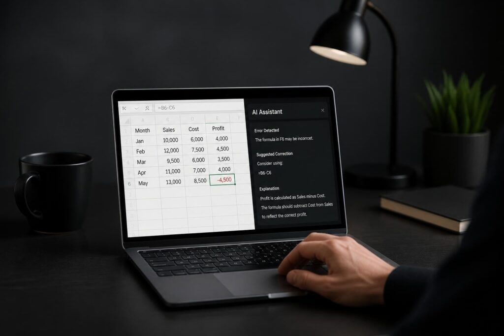
One breakthrough feature is Excel’s Agent Mode, which fixes broken formulas and suggests improvements to your dashboard calculations. When you're building a dashboard and encounter a #REF! or #VALUE! error, Agent Mode diagnoses the problem and offers corrections in plain language.
This capability proves invaluable when creating complex dashboard formulas that reference multiple sheets or dynamic ranges. Instead of debugging for hours, you simply describe what you're trying to calculate, and the AI generates the appropriate formula. Users interested in how to use Copilot in Excel will find this feature particularly useful for dashboard development.
Natural Language Dashboard Commands
Excel's AI now accepts conversational instructions for dashboard creation. You can type commands like "create a monthly revenue trend chart" or "show top 10 customers by purchase value," and the system generates the appropriate visualization with minimal manual intervention.
| Command Type | Example | Dashboard Element Created |
|---|---|---|
| Trend Analysis | "Show sales trends over the past 12 months" | Line chart with month-over-month comparison |
| Rankings | "Display top 5 products by profit margin" | Horizontal bar chart with sorted values |
| Comparisons | "Compare regional performance year-over-year" | Clustered column chart with regions |
| KPIs | "Calculate total revenue and growth rate" | Formatted metric cells with conditional formatting |
External AI Tools for Advanced Dashboards
While native Excel AI features continue expanding, specialized external tools offer advanced capabilities for users who need more sophisticated dashboard solutions. These platforms integrate with your existing Excel workflows while providing enhanced visualization options and automated insights.
Standalone Dashboard Builders
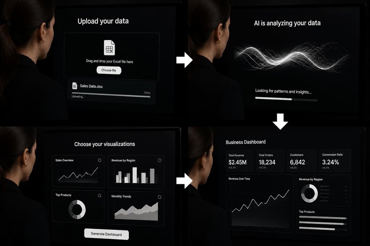
Tools like Bricks allow you to upload Excel files and transform them into professional dashboards using AI prompts. You describe the dashboard you need, and the AI builds charts, KPIs, and interactive elements automatically. This approach works particularly well when you need to share dashboards with stakeholders who don't use Excel.
Similarly, Vizro converts spreadsheets into interactive dashboards without requiring coding knowledge. The AI analyzes your data structure and creates appropriate visualizations, making it accessible even for users with limited technical expertise. For those exploring Excel dashboard creation with AI, these tools represent the cutting edge of what's possible.
AI-Powered Data Analysis Platforms
More comprehensive solutions like RowSpeak offer end-to-end data analysis workflows. You upload your Excel file, and the AI generates not just visualizations but also insights, anomaly detection, and predictive forecasts. The platform maintains a reviewable workflow, so you can verify every step the AI took to reach its conclusions.
- Automated insight generation: AI identifies trends, outliers, and correlations without manual analysis
- Multi-format support: Upload Excel, CSV, or database connections seamlessly
- Collaborative features: Share dashboards with team members and track changes
- Custom branding: Apply your organization's visual identity to AI-generated dashboards
Practical Strategies for AI Dashboard Implementation
Successfully implementing AI for Excel dashboards requires more than just choosing the right tools. You need a systematic approach that ensures your dashboards deliver actionable insights rather than just pretty visualizations.
Start with Clean, Structured Data
AI performs best when your Excel data follows consistent formatting rules. Before exploring how to use AI for Excel dashboards, organize your data with these principles:
- Single header row: Keep column headers in the first row only
- Consistent data types: Each column should contain one type of data (dates, numbers, text)
- No merged cells: Merged cells confuse AI pattern recognition
- Complete records: Fill in missing values or use consistent null indicators
- Remove subtotals: Embedded subtotals within data tables interfere with analysis
When your data structure is clean, AI tools can focus on generating insights rather than interpreting messy formatting. This preparation step significantly improves the quality of AI-generated dashboards.
Define Your Dashboard Objectives First
AI can create dozens of different visualizations from the same dataset, but not all will be useful. Before engaging AI tools, clarify what questions your dashboard needs to answer. Are you tracking performance against targets? Monitoring daily operations? Comparing scenarios?
| Dashboard Purpose | Recommended AI Features | Typical Visualizations |
|---|---|---|
| Executive Summary | Automated KPI calculation, trend detection | Scorecards, sparklines, summary tables |
| Operational Monitoring | Real-time data refresh, anomaly alerts | Gauges, status indicators, time-series charts |
| Comparative Analysis | Variance calculation, benchmark identification | Side-by-side bars, variance arrows, heat maps |
| Forecasting | Predictive modeling, confidence intervals | Trend projections, scenario analysis, probability ranges |
Leverage AI for Iterative Refinement
One of the most powerful aspects of AI dashboard tools is their ability to quickly iterate on designs. Unlike manual dashboard creation, where redesigning a chart takes significant effort, AI tools let you test multiple visualization approaches in seconds.
Use this capability to experiment with different chart types, color schemes, and layout options. Ask the AI to "show this data as a waterfall chart instead" or "group by quarter rather than month." The speed of iteration enables you to discover the most effective ways to communicate your data story.
Professionals who automate Excel reports with Copilot often find that this iterative approach reveals insights they wouldn't have discovered through traditional manual analysis.
Customizing AI-Generated Dashboards
While AI creates excellent starting points, the most effective dashboards combine AI efficiency with human judgment. You'll need to customize and refine AI outputs to match your specific business context and audience needs.
Adding Business Context to AI Suggestions
AI doesn't understand your industry benchmarks, seasonal patterns, or strategic priorities. After generating initial dashboard elements, enhance them with contextual information:
- Target lines: Add performance targets or goals to trending charts
- Annotations: Mark significant events that explain data anomalies
- Custom groupings: Reorganize AI-suggested categories to match your business structure
- Threshold formatting: Apply conditional formatting based on your performance standards
These customizations transform a generic AI dashboard into a strategic tool that speaks directly to your organization's needs.
Combining Multiple AI Tools
You don't need to commit to a single AI solution. Many Excel professionals use a hybrid approach, combining native Excel AI features with external platforms. For example, you might use Copilot for Excel data analysis to clean and prepare your data, then export to a specialized dashboard builder for final visualization.

This approach lets you leverage the strengths of each tool while maintaining flexibility in your workflow.
Maintaining and Updating AI Dashboards
Building a dashboard is just the beginning. The real value emerges when your dashboards stay current with fresh data and evolving business requirements. AI dramatically simplifies the maintenance process compared to traditional manual updates.
Automated Data Refresh Strategies
Modern AI dashboard tools support various data refresh methods:
- Direct Excel file monitoring: Tools automatically detect when you save changes to your source Excel file
- Scheduled imports: Configure daily, weekly, or monthly data pulls from your Excel workbooks
- API connections: Link dashboards directly to databases or cloud storage where Excel data resides
- Manual trigger options: Refresh dashboards on demand when you need the latest information
When learning how to use AI for Excel dashboards, understanding these refresh options helps you design sustainable solutions that don't require constant manual intervention. Users exploring how to automate Excel tasks with AI will find these refresh capabilities particularly valuable.
Version Control and Change Tracking
AI tools typically maintain historical versions of your dashboards, allowing you to revert changes or compare different design iterations. This version history proves invaluable when:
- Stakeholders request to see "how the dashboard looked last month"
- You need to undo an experimental design change
- Auditors require documentation of dashboard modifications
- Multiple team members collaborate on dashboard development
Most platforms offer side-by-side comparison views that highlight exactly what changed between versions, making it easy to track dashboard evolution over time.
Troubleshooting Common AI Dashboard Challenges
Even with AI assistance, you'll occasionally encounter challenges when building Excel dashboards. Understanding common issues and their solutions helps you work more efficiently.
When AI Misinterprets Your Data
Sometimes AI makes incorrect assumptions about your data structure or visualization needs. Common scenarios include:
- Treating text as numbers: Product codes or account numbers interpreted as quantitative data
- Incorrect date parsing: Date formats that don't match AI expectations
- Wrong aggregation level: Summing data that should be averaged, or vice versa
- Inappropriate chart selection: AI choosing visualizations that don't suit your message
When these situations arise, most AI tools allow you to provide corrective feedback. You can explicitly specify data types, preferred chart types, or aggregation methods. The more specific your instructions, the better the AI-generated results.
Performance Issues with Large Datasets
AI dashboard tools sometimes struggle with very large Excel files, particularly those exceeding 100,000 rows. If you experience slow performance:
- Pre-filter your data to include only relevant records
- Use Excel's built-in data model instead of flat worksheets
- Consider aggregating data before importing to AI tools
- Split very large datasets into multiple themed dashboards
For users working with extensive datasets, learning about the best AI tool for Excel automation can help identify solutions optimized for scale.
Security and Privacy Considerations
When using AI tools for Excel dashboards, particularly cloud-based platforms, you must consider data security implications. Many organizations handle sensitive financial, customer, or proprietary information in their spreadsheets.
Evaluating AI Tool Security
Before uploading Excel data to any AI platform, review their security practices:
| Security Feature | Why It Matters | Questions to Ask |
|---|---|---|
| Data encryption | Protects data in transit and storage | Is data encrypted both in transit and at rest? |
| Access controls | Limits who can view dashboards | Can I set user-level permissions? |
| Data residency | Determines where data is stored | Where are your servers located? |
| Retention policies | Controls how long data persists | Can I permanently delete my data? |
| Compliance certifications | Validates security standards | Are you SOC 2, GDPR, or HIPAA compliant? |
Understanding these factors helps you choose AI tools that align with your organization's security requirements and compliance obligations.
On-Premises vs. Cloud AI Solutions
Organizations with strict data governance requirements might prefer AI solutions that run locally rather than cloud-based platforms. Microsoft's native Copilot features, for instance, can operate within your existing Microsoft 365 security perimeter, keeping sensitive data within your control.
Alternatively, some specialized AI tools offer on-premises deployment options where the AI engine runs on your local servers. While these typically cost more than cloud subscriptions, they provide maximum data security for organizations in regulated industries.
Measuring Dashboard Effectiveness
Creating a dashboard with AI is fast and easy, but ensuring it delivers value requires ongoing assessment. Effective dashboards change behavior, inform decisions, and drive better outcomes.
Key Performance Indicators for Dashboards
Evaluate your AI-generated dashboards using these criteria:
- Usage frequency: How often do stakeholders actually open the dashboard?
- Decision impact: Can you identify specific decisions influenced by dashboard insights?
- Time savings: How much faster do users find information compared to manual reports?
- Accuracy improvements: Has the dashboard reduced data errors or misinterpretations?
- Question reduction: Are stakeholders asking fewer ad-hoc data questions?
When your dashboard scores well on these measures, you know your AI implementation is succeeding. If usage is low or stakeholders still request manual reports, revisit your dashboard design and data selection.
Continuous Improvement Through AI
One advantage of AI-powered dashboards is the ability to quickly test improvements based on user feedback. When stakeholders request changes or additional metrics, you can prototype solutions in minutes rather than hours.
This rapid iteration capability transforms dashboard development from a static project into a dynamic process of continuous refinement. Tools like Vizboard make it easy to adjust visualizations and add new insights as your analytical needs evolve.
Training Your Team on AI Dashboards
Successfully implementing AI for Excel dashboards requires more than just technical setup. Your team needs to understand how to interpret AI-generated visualizations and when to trust or question automated insights.
Building AI Literacy
Effective training programs cover both technical skills and conceptual understanding:
- How AI selects visualizations: Explain the logic behind chart type recommendations
- Interpreting confidence levels: Teach teams to evaluate the certainty of AI predictions
- Recognizing AI limitations: Help users understand when human judgment is needed
- Providing effective prompts: Train teams to give AI clear, specific instructions
- Validating AI outputs: Establish processes for verifying AI-generated insights
Organizations that invest in this training see higher adoption rates and better decision-making outcomes from their AI dashboard implementations.
Creating Dashboard Usage Guidelines
Document standards for when and how to use AI-generated dashboards in your organization. Guidelines might specify:
- Which types of decisions require dashboard consultation
- How often dashboards should be reviewed and updated
- Who has authority to modify dashboard designs
- Escalation procedures when dashboard data seems incorrect
- Integration points with existing reporting processes
These guidelines ensure consistency and prevent the common problem of dashboards being created but never actually used for decision-making.
Future Trends in AI Dashboard Technology
The intersection of AI and Excel dashboards continues evolving rapidly. Understanding emerging trends helps you prepare for upcoming capabilities and make forward-looking technology choices.
Predictive and Prescriptive Analytics
Current AI dashboards primarily offer descriptive analytics, showing what happened in your data. The next generation incorporates predictive capabilities, forecasting future trends based on historical patterns. Even more advanced systems provide prescriptive analytics, recommending specific actions based on data insights.
For instance, instead of just showing that sales are declining in a region, an AI dashboard might predict the decline will continue for three months and recommend specific marketing interventions to reverse the trend. These capabilities are already emerging in platforms like ADRO’s AI dashboard builder, which generates insights alongside visualizations.
Conversational Dashboard Interfaces
Voice and chat interfaces are becoming standard in AI dashboard tools. Rather than clicking through menus or typing complex queries, you'll simply ask questions like "Why did revenue drop last quarter?" and receive both visualizations and natural language explanations.
This conversational approach makes dashboards accessible to users who lack technical Excel skills, democratizing data access across organizations. The technology combines natural language processing with automated visualization generation to create truly interactive analytical experiences.
Integration with Business Intelligence Ecosystems
AI dashboards are increasingly connecting with broader business intelligence platforms, CRM systems, and enterprise resource planning tools. This integration means your Excel data can combine with information from multiple sources to create comprehensive analytical views.
When exploring how to use AI for Excel dashboards in this integrated context, you're not just visualizing spreadsheet data but orchestrating insights from your entire business technology stack. Excel becomes one data source among many, all unified through AI-powered dashboard interfaces.
Mastering how to use AI for Excel dashboards transforms your ability to extract value from data, enabling faster insights and more informed decisions. Whether you're leveraging native Excel AI features or specialized dashboard builders, the key is starting with clean data, defining clear objectives, and continuously refining your approach based on user needs. If you're struggling with complex spreadsheet challenges or need expert guidance on implementing AI-powered solutions, The Analytics Doctor provides personalized training and consulting to help you build smarter, more effective Excel dashboards that truly serve your business goals.