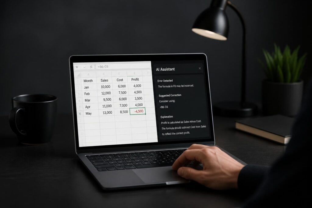
Excel pivot tables transform thousands of rows of raw data into clear, actionable summaries in minutes. Whether you're analyzing sales performance, tracking expenses, or monitoring inventory levels, understanding how to build a pivot table excel will revolutionize your data analysis workflow. This comprehensive guide walks you through every step of the process, from preparing your source data to customizing advanced features that make your reports audit-ready and presentation-perfect. By the end, you'll have the confidence to tackle complex datasets and extract meaningful insights without writing a single formula.
Understanding What Makes Pivot Tables Essential
Pivot tables serve as Excel's most powerful data analysis tool because they eliminate manual summarization work. Instead of creating dozens of formulas to calculate totals by region, product, or time period, you can drag and drop fields to instantly reshape your data perspective.
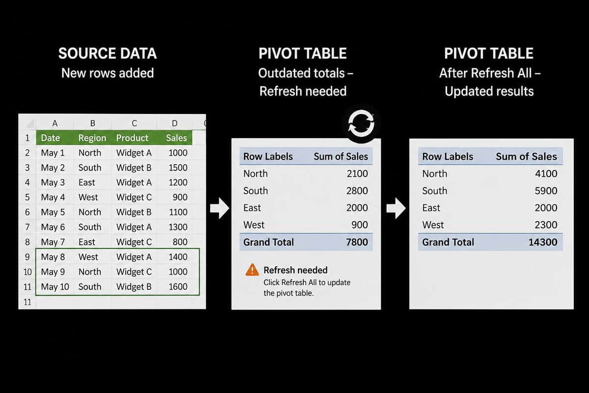
The core advantage lies in dynamic reorganization. When your underlying data changes, a simple refresh updates your entire analysis. This makes pivot tables indispensable for monthly reporting, budget tracking, and performance monitoring across departments.
Key benefits include:
- Speed: Summarize 50,000 rows in seconds rather than hours of manual work
- Flexibility: Rearrange dimensions instantly to answer new questions
- Accuracy: Eliminate formula errors that plague manual calculations
- Scalability: Handle datasets that would crash traditional worksheet functions
Most professionals waste valuable time building complex formula structures when learning how to build a pivot table excel could solve their problem in minutes. The initial time investment in mastering this skill pays dividends every reporting cycle.
Preparing Your Source Data Properly
Before you can build an effective pivot table, your source data must follow specific structural rules. Poor data preparation causes 80% of pivot table problems users encounter.
Required Data Structure Elements
Your source data should resemble a database table with these characteristics:
- Column headers in the first row: Each column needs a unique, descriptive name
- No blank rows or columns: Every row should contain data without gaps
- Consistent data types: Each column should contain the same type of information throughout
- No merged cells: Merged cells break pivot table functionality
- Dates formatted as actual dates: Text that looks like dates won't calculate properly
| Good Structure | Poor Structure |
|---|---|
| Date, Product, Region, Sales | Missing headers, blank rows |
| 1/1/2026, Widget A, East, $500 | Merged cells for categories |
| 1/2/2026, Widget B, West, $750 | Subtotals within data |
Your data should exist in a continuous range or formatted Excel table. Tables offer significant advantages because they automatically expand when you add new rows, keeping your pivot table source range current.
Common Data Cleanup Tasks
Address these issues before creating your pivot table:
- Remove duplicate records that skew totals
- Fill in blank cells in categorical columns
- Standardize text entries (eliminate variations like "NY" versus "New York")
- Convert text numbers to actual numeric values
- Ensure currency values use consistent formatting
When your data contains inconsistencies, your pivot table will create separate categories for what should be grouped together. Taking fifteen minutes to clean your data saves hours of troubleshooting later. For complex datasets requiring validation, the principles in Excel data validation rules apply equally to pivot table source preparation.
Step-by-Step Process to Build Your First Pivot Table
Understanding how to build a pivot table excel requires following a systematic approach. This walkthrough assumes you're using Excel 2021 or Microsoft 365, though the process remains similar across recent versions.
Selecting Your Data Range
Click any cell within your data range. Excel automatically detects the continuous range of data surrounding your selection. For precise control, manually select from the top-left cell (including headers) to the bottom-right cell of your dataset.
If your data exists in an Excel table (formatted with Ctrl+T), simply click anywhere in the table. Excel recognizes the entire table as your source range automatically.
Inserting the Pivot Table
- Navigate to the Insert tab on the ribbon
- Click PivotTable in the Tables group
- In the dialog box, verify the selected range is correct
- Choose where to place the pivot table: new worksheet (recommended) or existing worksheet
- Click OK to create the blank pivot table framework
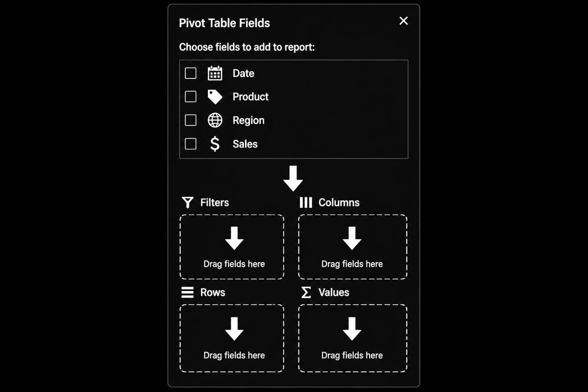
A new sheet appears with the pivot table placeholder on the left and the PivotTable Fields pane on the right. This pane controls everything about your pivot table structure.
Building Your First Analysis
The PivotTable Fields pane divides into two sections: available fields at the top and four areas at the bottom (Filters, Columns, Rows, Values). Understanding how to create dashboards in Excel becomes much easier once you master this field placement logic.
To create a basic sales summary by product:
- Drag Product from the field list to the Rows area
- Drag Sales Amount to the Values area
- Excel automatically sums the sales for each product
Your pivot table now displays total sales grouped by product. The beauty of this approach is that you can immediately see patterns without writing a single SUM formula.
Configuring Rows, Columns, and Values
The real power of understanding how to build a pivot table excel emerges when you learn to manipulate the four areas strategically. Each area serves a distinct purpose in shaping your analysis.
Rows Area Strategy
Fields in the Rows area create vertical groupings. You can nest multiple fields to create hierarchies. For example:
- Region (outer grouping)
- Sales Rep (nested within each region)
- Product (nested within each sales rep)
- Sales Rep (nested within each region)
This hierarchy lets you expand and collapse sections to view different detail levels. Excel displays subtotals at each grouping level automatically.
Columns Area Applications
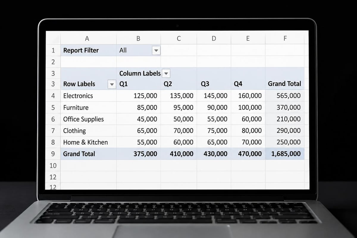
The Columns area creates horizontal categories. This works perfectly for time-based analysis:
| Product | Q1 2026 | Q2 2026 | Q3 2026 | Q4 2026 | Grand Total |
|---|---|---|---|---|---|
| Widget A | $45,200 | $52,300 | $48,900 | $61,400 | $207,800 |
| Widget B | $38,100 | $41,200 | $39,600 | $44,300 | $163,200 |
Placing Quarter in columns while Product remains in rows creates this cross-tabulated view instantly.
Values Area Calculations
When you drag a field to the Values area, Excel makes an assumption about calculation type:
- Numeric fields: Default to Sum
- Text fields: Default to Count
Right-click any value cell and select Value Field Settings to change the calculation type. Available options include:
- Sum, Average, Count
- Min, Max, Standard Deviation
- Percentage calculations (% of Grand Total, % of Parent Row, etc.)
You can add the same field multiple times with different calculations. For instance, add Sales twice-once showing Sum and once showing Average-to see both total revenue and average transaction size side-by-side.
Filters Area Functionality
Fields in the Filters area create report-level filters above your pivot table. This lets you quickly focus on specific segments without rebuilding the table structure.
Add Year to filters, and you can switch between 2024, 2025, and 2026 data views using a single dropdown. The comprehensive guide on how to create pivot tables demonstrates several advanced filtering techniques worth exploring.
Customizing Pivot Table Appearance and Layout
Raw pivot tables rarely match corporate reporting standards. Excel provides extensive customization options to transform functional analysis into polished presentations.
Applying Pivot Table Styles
The Design tab appears whenever you click inside a pivot table. The Styles gallery offers dozens of professionally formatted options:
- Click any cell in your pivot table
- Navigate to the PivotTable Design tab
- Hover over style thumbnails to preview formatting
- Click to apply your chosen style
Style Options checkboxes let you toggle:
- Banded rows or columns for easier reading
- Row and column headers with different formatting
- Special formatting for the first and last columns
Number Formatting Best Practices
Unformatted numbers reduce credibility. Right-click any value in your pivot table, select Value Field Settings, then click Number Format:
- Currency: Use for financial data with appropriate decimal places
- Percentage: Essential for ratio calculations
- Thousands separator: Makes large numbers readable
- Custom formats: Create specialized displays like "Q1 2026" from date fields
Consistent number formatting across all reports builds professional credibility and reduces interpretation errors during presentations.
Layout Configuration Options
The Design tab's Report Layout button offers three distinct layouts:
- Compact Form: Saves space by placing all row fields in a single column with indentation
- Outline Form: Each row field gets its own column with subtotals at the top of groups
- Tabular Form: Traditional table format with subtotals at the bottom of groups
Blank Rows settings let you insert spacing between groups for improved readability. Subtotal positioning (top versus bottom of groups) affects how users scan your reports during meetings.
Advanced Pivot Table Techniques
Once you master basic construction, these advanced techniques will elevate your analysis capabilities significantly.
Grouping Date and Numeric Data
Right-click any date in your rows or columns and select Group to consolidate:
- Days into weeks, months, quarters, or years
- Custom date ranges (every 15 days, for instance)
- Numeric ranges (age brackets, price tiers, score ranges)
Grouping transforms granular daily transaction data into monthly trend reports instantly. For time-series analysis, you might group dates by both Month and Year to create period-over-period comparisons.
Calculated Fields and Items
When your source data lacks a needed calculation, create it directly in the pivot table:
Calculated Fields add new metrics based on existing fields. Access this through PivotTable Analyze > Fields, Items & Sets > Calculated Field. For example, create a Profit Margin field using the formula =Profit/Revenue.
Calculated Items add new members within an existing field. If your Region field contains East, West, North, and South, you could create a "Coastal" calculated item that sums East and West.
These calculations update automatically as source data changes, maintaining accuracy across reporting periods.
Creating Multiple Pivot Tables from One Cache
When you need several related views of the same dataset, build additional pivot tables that share the source cache:
- Right-click inside your existing pivot table
- Select PivotTable Options
- Note the cache name
- Create new pivot tables using PivotTable Analyze > PivotTable > Create from Cache
This approach saves memory and ensures consistent data across multiple reports. It's particularly valuable when building Excel dashboards with multiple visualization perspectives.
Refreshing and Maintaining Pivot Tables
Understanding how to build a pivot table excel includes knowing how to keep it current as source data evolves. Pivot tables don't update automatically when source data changes.
Manual Refresh Methods
Click anywhere in your pivot table and use one of these methods:
- Right-click and select Refresh
- PivotTable Analyze tab > Refresh button
- Keyboard shortcut: Alt + F5 (refreshes active pivot table only)
- Ctrl + Alt + F5: Refreshes all pivot tables in the workbook
Schedule regular refreshes before important meetings to ensure accuracy. Nothing undermines credibility faster than presenting last month's numbers as current data.
Automatic Refresh on File Open
Configure pivot tables to refresh automatically when you open the workbook:
- Right-click inside the pivot table
- Select PivotTable Options
- On the Data tab, check Refresh data when opening the file
- Click OK
This setting ensures your dashboard workbooks display current information immediately when stakeholders open them, eliminating the manual refresh step.
Handling Source Data Changes
When you add columns to your source data or expand the data range:
- Click inside the pivot table
- Navigate to PivotTable Analyze > Change Data Source
- Update the range reference to include new rows or columns
- Click OK
If your source data exists in an Excel table, the pivot table automatically includes new rows without manual range updates. This represents another compelling reason to convert data ranges to tables before creating pivot tables. The detailed tutorial on how to work with pivot tables covers range management extensively.
Troubleshooting Common Pivot Table Issues
Even experienced users encounter challenges when building pivot tables. These solutions address the most frequent problems.
Blank Cells in Row or Column Areas
Problem: Your pivot table shows "(blank)" as a category.
Solution: Return to source data and fill blank cells in the corresponding column. Alternatively, use pivot table filtering to hide the (blank) category from display.
Numbers Displaying as Text
Problem: Excel counts numeric values instead of summing them.
Solution: The source column contains text-formatted numbers. In the source data, select the column, use Data > Text to Columns, and click Finish without changing settings. This converts text to actual numbers.
Pivot Table Won't Refresh
Problem: Clicking Refresh doesn't update the data.
Solution: Verify the source data range hasn't been deleted or moved. Check PivotTable Analyze > Change Data Source to confirm the range reference is valid.
Wrong Calculation Type
Problem: Excel averages your numbers when you need a sum (or vice versa).
Solution: Right-click any value cell, select Value Field Settings, and change the calculation type under Summarize value field by.
Memory or Performance Issues
Problem: Large pivot tables slow down or crash Excel.
Solution: Reduce source data size by removing unnecessary columns, archiving old data, or using Power Pivot for datasets exceeding 100,000 rows. The techniques in Power Pivot and data modeling extend Excel's capacity significantly.
Pivot Table Best Practices for Professional Reports
Following these standards ensures your pivot tables remain maintainable, accurate, and audit-ready across teams and reporting cycles.
Documentation Standards
Always include:
- Data source location: Document where the underlying data originates
- Last refresh date: Add a text box showing when data was last updated
- Calculation definitions: Explain custom calculated fields in nearby cells
- Filter states: Make clear what filters are currently applied
This documentation prevents confusion when colleagues inherit your workbooks or when you revisit reports months later.
Formatting Consistency
Establish organizational standards for:
- Number formats (currency decimals, thousands separators)
- Color schemes that match corporate branding
- Layout preferences (compact versus tabular)
- Subtotal and grand total visibility
Consistent formatting across all reports reduces cognitive load during executive presentations and speeds stakeholder comprehension.
Version Control
Save dated versions before major changes:
- Naming convention: "Sales_Analysis_2026_05_21.xlsx"
- Change log: Maintain a worksheet documenting modifications
- Backup copies: Store previous month's reports before building current month
This practice becomes critical when stakeholders question month-over-month changes or when you need to recreate historical analysis.
Testing and Validation
Before distributing pivot table reports:
- Manually verify several totals against source data
- Test refresh functionality with updated data
- Confirm formulas referencing pivot table cells still work
- Check printing and PDF export appearance
- Validate filters display correct default states
Spending five minutes on validation prevents embarrassing errors during high-stakes presentations. The comprehensive audit checklist applies equally to pivot table quality assurance.
Converting Pivot Tables to Static Data
Sometimes you need to preserve pivot table results as permanent values rather than dynamic summaries. This technique proves valuable for historical snapshots or when sharing analysis with users who shouldn't access underlying data.
Copy as Values Method
- Select the entire pivot table (click the top-left corner selector)
- Press Ctrl + C to copy
- Navigate to a new location or worksheet
- Right-click and select Paste Special > Values
This creates a static copy disconnected from the source data. Format adjustments won't affect the original pivot table.
Benefits of Static Snapshots
- Historical comparison: Preserve month-end results before refreshing with new data
- Security: Share summarized insights without exposing detailed source data
- Distribution: Send findings to users without Excel or pivot table knowledge
- Performance: Large reports open faster without live pivot table calculations
Remember that static copies don't update when source data changes. Clearly label these as "snapshot as of [date]" to prevent confusion.
Integrating Pivot Tables with Charts
Visual representations dramatically increase pivot table impact during presentations and dashboards. Excel's PivotChart feature maintains synchronization between table and visualization.
Creating PivotCharts
- Click inside your pivot table
- Navigate to PivotTable Analyze > PivotChart
- Select your preferred chart type (column, line, pie)
- Click OK
The resulting chart automatically reflects your pivot table structure. When you filter or rearrange the pivot table, the chart updates instantly.
Chart Type Selection
Choose chart types strategically:
| Analysis Type | Recommended Chart |
|---|---|
| Part-to-whole relationships | Pie or donut charts |
| Trends over time | Line or area charts |
| Category comparisons | Column or bar charts |
| Distribution analysis | Histogram or box plots |
Avoid 3D charts and excessive decoration that reduces clarity. Your goal is instant comprehension, not artistic impression.
Slicers for Interactive Filtering
Add slicers to create user-friendly filter controls:
- Click the pivot table
- PivotTable Analyze > Insert Slicer
- Check fields you want as visual filters
- Click OK
Slicers appear as clickable buttons. Users can filter by clicking categories without understanding pivot table mechanics. This makes dashboards accessible to non-technical stakeholders who need to explore data independently.
Multiple pivot tables and charts can connect to the same slicers, creating synchronized dashboard experiences where one click filters multiple visualizations simultaneously. This technique forms the foundation of professional Excel dashboard design.
Mastering how to build a pivot table excel transforms you from someone who manually summarizes data to an analyst who extracts insights in seconds. These skills reduce reporting time, eliminate calculation errors, and unlock analytical perspectives impossible with traditional formulas. When you encounter complex spreadsheet challenges or need customized training to accelerate your team's Excel capabilities, The Analytics Doctor provides personalized solutions that turn frustrating data problems into streamlined, audit-ready workflows. Whether you need hands-on training, workbook troubleshooting, or automated report development, expert help is available to make your data work harder for you.