Data-driven decision making is transforming the business world, and organizations are turning to Excel dashboards for fast, actionable insights. With the ability to convert raw data into clear, interactive visuals, dashboards help professionals make smarter choices in less time.
In 2026, knowing how to create dashboards in excel is a must-have skill that employers across industries demand. This guide will show you step by step how to create dashboards in excel, share proven best practices, advanced techniques, and help you avoid common mistakes.
Whether you are a beginner or looking to refine your skills, you will learn everything needed to build dynamic, professional dashboards in Excel.
Understanding Excel Dashboards: Fundamentals and Benefits
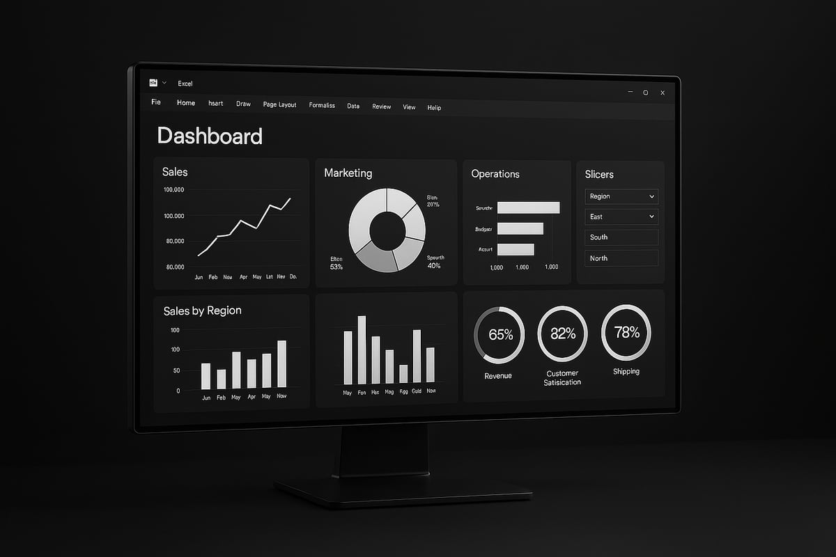
Excel dashboards have become an essential tool for organizations seeking to transform raw data into actionable insights. At their core, Excel dashboards are interactive, visual summaries built within Excel that present key metrics, trends, and data points in a single, easy-to-understand view. Unlike standard spreadsheets, which often contain dense tables of numbers, dashboards use charts, tables, and visual controls to make complex information accessible at a glance.
The difference between dashboards, reports, and spreadsheets lies in their purpose and design. Dashboards focus on real-time monitoring and decision support, while reports are typically static and historical, and spreadsheets serve as data storage or calculation tools. Businesses across finance, marketing, operations, and sales rely on Excel dashboards to track performance, flag issues, and drive informed decisions. If you want to learn how to create dashboards in excel for your own business needs, understanding these distinctions is the first step.
What Is an Excel Dashboard?
An Excel dashboard is a dynamic, interactive display that brings together multiple data sources into a unified visual interface. Core components include data tables, pivot tables, charts, and interactive elements like slicers or dropdowns. The ability to summarize and visualize data in real time is what sets dashboards apart from static reports.
Common use-cases for Excel dashboards include financial performance tracking, marketing campaign analysis, sales monitoring, and operational efficiency reporting. Mastering how to create dashboards in excel allows professionals to quickly spot trends, compare outcomes, and communicate results clearly.
Key Benefits of Using Dashboards in Excel
Leveraging Excel dashboards offers several significant advantages. First, real-time data visualization enables immediate monitoring of critical metrics. This leads to faster, more confident decision-making and boosts organizational efficiency.
Another key benefit is accessibility. Excel dashboards are cost-effective compared to specialized BI tools and can be shared easily across teams. For example, a retail business that learned how to create dashboards in excel was able to track sales by region and product, leading to faster inventory decisions and increased revenue.
- Real-time insights
- Enhanced efficiency
- Low cost and broad accessibility
Essential Elements of a Powerful Dashboard
To build effective dashboards, focus on these core elements:
- Reliable data sources and robust data integrity checks
- Visual components such as charts, tables, and KPIs
- Interactive controls like slicers and dropdowns
Clarity and simplicity are crucial. A user-focused design ensures the most important information stands out, while unnecessary clutter is avoided. Professionals who prioritize these elements when learning how to create dashboards in excel deliver tools that are both powerful and user-friendly.
Dashboard Trends for 2026
The landscape of Excel dashboards is evolving rapidly. Automation and AI-driven insights are becoming standard, providing deeper analysis with less manual effort. Integration with cloud-based data sources allows for seamless, up-to-date information.
Mobile-friendly and shareable dashboard designs are now in high demand. According to Gartner, 75% of organizations plan to expand dashboard usage by 2026. To stay ahead, explore the latest Dashboard Design Trends 2026: AI & Real-Time Insights, which highlights how to create dashboards in excel that harness automation, AI, and real-time data for maximum impact.
Preparing Your Data for Dashboard Creation
Before you dive into how to create dashboards in excel, it is vital to ensure your data is well-prepared. Proper data preparation forms the foundation for reliable analysis and meaningful insights. In this section, we will walk through essential steps to get your data dashboard-ready, from collection to ongoing integrity.
Data Collection and Cleaning
The first step in how to create dashboards in excel is gathering your data from reliable sources. Excel supports importing from CSV files, database connections, and APIs, enabling flexibility for various business needs.
Accuracy and consistency are essential. Always check for duplicate entries, incomplete fields, and inconsistencies. For example, if you are preparing sales data for a monthly performance dashboard, remove any erroneous rows and standardize date formats.
Best practices in this stage include:
- Verifying data source credibility
- Removing unnecessary columns and rows
- Using Excel’s built-in cleaning tools like
TRIM,CLEAN, andRemove Duplicates
A clean dataset saves time and reduces errors later in the dashboarding process.
Structuring Data for Analysis
Once your data is clean, structuring it properly is key for how to create dashboards in excel that are both dynamic and scalable. Excel tables, named ranges, and structured references make your data easier to manage and update.
Organize your data so each column represents a variable, and each row represents a unique record. Use tables to allow for automatic expansion as new data is added.
A real-world example: An HR department restructures employee records into a table with named ranges, making it simple to build dynamic reports that update automatically with new hires or departures.
Keep your data organized and your dashboard will remain robust as your needs grow.
Data Validation and Error Checking
Maintaining data quality is critical in how to create dashboards in excel. Apply data validation rules to prevent incorrect entries, such as restricting values to a certain range or format.
Leverage formulas like ISERROR and IFERROR to catch and manage potential issues in calculations. Excel also offers auditing tools to help trace errors and inconsistencies.
For a comprehensive approach, refer to the Excel Data Validation Rules resource, which details methods to bulletproof your data before dashboarding.
Incorporating these checks ensures your dashboards remain trustworthy and accurate.
Creating a Data Model with Excel Tools
Taking your preparation further, use Excel’s advanced tools for data modeling. Power Query enables you to automate data transformation tasks, such as merging tables or removing duplicates, which is essential for how to create dashboards in excel at scale.
Power Pivot allows you to create relationships between multiple tables, supporting more complex calculations and analysis. By building a data model, you can integrate sales, finance, and customer data into one unified dashboard.
Leveraging these tools not only saves time but also enhances the depth and reliability of your dashboard insights.
Maintaining Data Integrity Over Time
Ongoing data management is a core part of how to create dashboards in excel that remain effective long-term. Set up automated data refreshes so your dashboards always display the latest information.
For collaborative projects, employ version control strategies, such as saving dated copies or using cloud services with change tracking. This prevents accidental overwrites and facilitates teamwork.
It is worth noting that 60% of dashboard errors result from poor data management practices. Regular audits and workflow discipline will help you avoid these pitfalls and keep your dashboards running smoothly.
Step-by-Step Guide: Building Your First Excel Dashboard
Ready to learn how to create dashboards in excel that are both dynamic and professional? This step-by-step guide will walk you through the essential process, from identifying your goals to sharing your finished dashboard with your team. Whether you're building your first dashboard or refining your skills for 2026, each step is designed to help you work smarter, not harder.
Step 1: Define Your Dashboard Objectives
The first step in how to create dashboards in excel is to clearly define your dashboard’s purpose. Start by identifying the key questions your dashboard should answer. What business problem are you solving? What are the critical metrics or KPIs you need to track?
Align these objectives with your organization’s goals. For example, if you are building a marketing campaign dashboard, focus on metrics like click-through rates, conversions, and cost per acquisition. Clarifying these points ensures your dashboard delivers real value and keeps your project focused.
Write down your objectives and the data sources you’ll need. This will serve as your roadmap for the rest of the process and help you make informed design decisions as you move forward.
Step 2: Plan Your Dashboard Layout
Once you know your objectives, the next step in how to create dashboards in excel is designing a user-friendly layout. Sketch a wireframe or mockup using paper, whiteboard, or a digital tool. Decide where each chart, table, or KPI will appear.
Consider the user experience. Place the most important information at the top or in the center, where it will be seen first. Think about the types of visuals that best represent your data: bar charts for comparisons, line charts for trends, and tables for detailed information.
Prioritize clarity and simplicity. Avoid crowding your dashboard with too many visuals. A clean, organized layout makes it easier for users to interpret the data and act on insights quickly.
Step 3: Import and Prepare Data
Reliable data is at the heart of how to create dashboards in excel. Connect to your data sources, whether it’s a CSV file, database, or an online service. Use Excel’s built-in tools, like Power Query, to import and transform your data.
Clean your data by removing duplicates, fixing errors, and standardizing formats. This step is crucial for ensuring your dashboard calculations are accurate. Make sure your data is up to date, especially if you’re tracking metrics that change frequently.
By preparing your data properly, you lay a solid foundation for analysis and visualization, reducing the risk of costly mistakes later on.
Step 4: Create Supporting Calculations and KPIs
Now, it’s time to calculate the metrics that matter. In how to create dashboards in excel, using formulas like SUMIFS, COUNTIFS, and AVERAGEIFS helps you build dynamic KPIs and summary tables.
For example, to calculate monthly revenue trends, create a summary table using these functions. You can also add calculated columns for custom metrics, such as profit margins or growth rates. Keep calculations in a separate sheet or area for easier troubleshooting.
Accurate and well-structured calculations ensure your dashboard delivers actionable insights and can adapt to changing business needs.
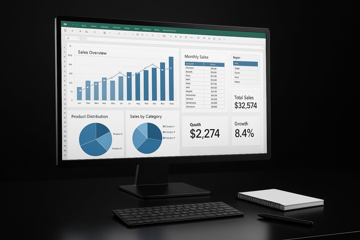
Step 5: Build Visualizations
With your calculations ready, you can begin visualizing your data. The key to how to create dashboards in excel is choosing the right chart types for your audience and objectives. Use bar charts for category comparisons, line charts for trends, and pie charts for proportions.
Customize your visuals for maximum clarity: label axes, use color strategically, and keep chart titles concise. Avoid clutter and misleading graphics. For deeper insights, consider using pivot tables, which allow you to summarize and analyze large datasets interactively. Learn more about Creating Excel Pivot Tables to enhance your dashboard’s analytical power.
Effective visualizations turn raw numbers into compelling stories, making it easier for stakeholders to take action.
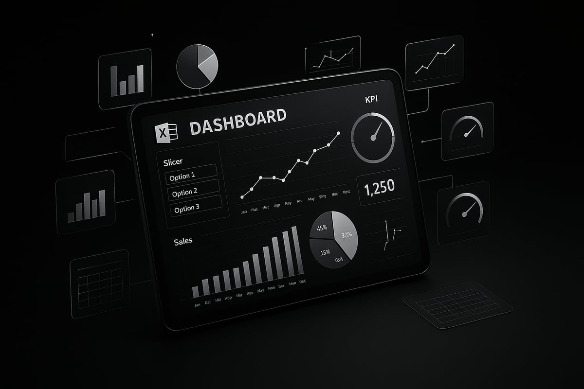
Step 6: Add Interactivity with Form Controls and Slicers
Interactivity is a game changer in how to create dashboards in excel. Add form controls like dropdowns, checkboxes, and slicers to enable dynamic filtering and user-driven exploration.
For example, use a slicer to let users select a sales region, instantly updating all related charts and tables. This flexibility empowers users to answer their own questions and spot trends that matter most to them.
Interactive elements make your dashboard more engaging and adaptable, increasing its value across teams and departments.
Step 7: Assemble and Format the Dashboard
Now, bring everything together. Arrange your visuals, controls, and KPIs in a logical flow that mirrors your initial wireframe. Use Excel’s formatting tools to apply consistent fonts, colors, and borders.
Brand your dashboard with your company’s logo and color palette. Use themes and templates for a polished, professional appearance. Consistent formatting not only looks better but also makes your dashboard easier to read and navigate.
A well-formatted dashboard reflects attention to detail and builds trust with your audience.
Step 8: Test, Review, and Optimize
Even the best-designed dashboards need testing. In how to create dashboards in excel, check for calculation errors, broken links, and outdated data. Use Excel’s error-checking tools and ask colleagues to review your work.
Gather feedback from end users. Are the visuals clear? Can they find what they need quickly? Use this input to make iterative improvements, refining performance and usability.
Regular testing and optimization ensure your dashboard remains accurate, reliable, and user-focused as business needs evolve.
Step 9: Share and Collaborate
The final step in how to create dashboards in excel is sharing your work. Choose the best method for your audience: cloud sharing, PDF export, or a shared workbook.
Set permissions to protect sensitive information. For collaborative projects, track changes and maintain version control to avoid confusion. In finance teams, for example, shared dashboards enable real-time collaboration and faster decision-making.
Effective sharing practices help your dashboard reach its full potential, driving smarter decisions across your organization.
Advanced Dashboard Techniques and Best Practices
Excel dashboards have evolved rapidly, and mastering advanced techniques is essential for staying ahead. In this section, you will discover expert strategies on how to create dashboards in excel that are dynamic, scalable, and ready for the future.
Leveraging Power Query and Power Pivot
Learning how to create dashboards in excel means understanding the power of Power Query and Power Pivot. Power Query automates data imports and cleanses large datasets with just a few clicks. Power Pivot enables you to build relationships between multiple tables, letting you create unified insights from disparate sources.
For example, you can combine sales, inventory, and customer data to analyze trends across your business. To dive deeper, check out the Power Pivot and Data Modeling Guide for expert tips on building robust, error-proof models.
Using Dynamic Charts and Conditional Formatting
To stand out with how to create dashboards in excel, use dynamic charts that update automatically when new data arrives. Line charts, bar graphs, and combo charts can all be linked to dynamic ranges, so visuals always reflect the latest numbers.
Conditional formatting is another game changer. Highlight trends, spot outliers, or flag issues instantly with color scales and data bars. For instance, use heatmaps to visualize sales performance by region, making it easy to identify high and low performers at a glance.
Incorporating Formulas and Named Ranges for Flexibility
A key part of how to create dashboards in excel is building flexibility into your calculations. Advanced formulas like INDEX, MATCH, OFFSET, and INDIRECT empower your dashboards to adapt to changing data and user selections.
Named ranges make maintenance easier and reduce errors, especially in complex workbooks. By referencing names instead of cell addresses, your formulas remain readable and robust even as your data grows.
Enhancing Interactivity with Advanced Controls
Interactive dashboards drive user engagement and deeper analysis. When exploring how to create dashboards in excel, add timeline slicers for time-based filtering, scroll bars for value adjustments, and combo boxes for scenario analysis.
These controls let users filter data, test different scenarios, and drill into details with ease. For example, a budget dashboard can use scroll bars to visualize how spending changes affect the bottom line in real time.
Dashboard Performance Optimization
Performance matters when learning how to create dashboards in excel. Large files can slow down analysis and frustrate users. Reduce file size by removing unused data, limiting volatile formulas, and using efficient data structures.
Optimize speed by loading only necessary data and leveraging Excel’s calculation options. According to Microsoft, optimized dashboards load 40 percent faster on average, ensuring users get answers without delay.
Ensuring Accessibility and Mobile Compatibility
Accessibility and mobile readiness are now critical in how to create dashboards in excel. Design dashboards for different screen sizes by using responsive layouts, larger fonts, and clear color contrasts. Keyboard navigation and descriptive labels make dashboards usable for everyone.
Stay updated on the latest trends, as discussed in the Dashboard Design Trends That Made an Impact in 2025, to ensure your dashboards remain modern and effective in any environment.
Common Mistakes and How to Avoid Them
Mastering how to create dashboards in excel means steering clear of common pitfalls that can undermine your data’s value and your audience’s trust. Even seasoned professionals can fall into these traps. By understanding these mistakes, you’ll build dashboards that are clear, reliable, and actionable.

Overloading Dashboards with Data
One of the most frequent mistakes when learning how to create dashboards in excel is cramming too much information onto a single screen. This leads to confusion, delays in decision making, and reduced dashboard adoption.
- Too many charts or tables can overwhelm users.
- Irrelevant metrics distract from your key objectives.
- Complex visuals make it hard to spot trends.
For example, a sales dashboard overloaded with product-level data may obscure overall performance, frustrating executives who need quick insights. To avoid this, focus on critical KPIs, use summaries, and keep layouts clean. Simplicity encourages action and makes dashboards more effective.
Ignoring Data Quality and Refresh Issues
No matter how visually appealing your dashboard is, unreliable or outdated data will destroy its credibility. When you think about how to create dashboards in excel, always prioritize data integrity.
- Outdated data leads to incorrect conclusions.
- Inconsistent formats cause calculation errors.
- Manual updates increase the risk of mistakes.
Establish automated refresh routines and use data validation tools. For deeper strategies, see Reducing Spreadsheet Errors in Excel, which details error reduction workflows. Remember, a single data error can have costly consequences, especially in financial reporting.
Poor Visual Design Choices
Visual design errors can make even the most accurate dashboards misleading. When learning how to create dashboards in excel, pay close attention to color, layout, and chart selection.
- Inconsistent colors and fonts confuse users.
- Poor chart choices distort data interpretation.
- Lack of alignment or spacing reduces readability.
According to the Data Visualization Society, 50% of users misinterpret dashboards due to poor design. Stick to a clear color scheme, align visuals, and choose chart types that best represent your data. Effective design builds trust and helps users act with confidence.
Lack of User-Centric Design
A dashboard is only as good as its ability to serve its users. Ignoring user needs is a critical error when considering how to create dashboards in excel.
- Failing to gather user feedback results in low adoption.
- Complicated navigation frustrates busy professionals.
- Ignoring workflow integration reduces dashboard value.
Usability testing is essential. For example, after collecting feedback, a team redesigned their dashboard to prioritize mobile access and simplified filters, resulting in higher engagement. Always involve end users early and iterate based on their input to maximize your dashboard’s impact.