Excel dashboards have transformed business reporting, but creating them traditionally requires significant time and technical expertise. Today's artificial intelligence tools are revolutionizing this process, enabling users to build professional dashboards in minutes rather than hours. This ai powered excel dashboard tutorial walks you through leveraging AI to create dynamic, interactive dashboards that deliver actionable insights without extensive manual configuration. Whether you're tracking sales performance, monitoring financial metrics, or analyzing operational data, AI can streamline your dashboard creation workflow significantly.
Understanding AI-Enhanced Dashboard Creation
Modern AI tools integrate directly with Excel to automate the most time-consuming aspects of dashboard development. These technologies analyze your data structure, suggest relevant visualizations, and generate formulas automatically.
The traditional dashboard creation process involves data cleaning, pivot table configuration, chart design, and formula writing. Each step requires careful attention and Excel expertise. AI accelerates this workflow by understanding your data context and making intelligent recommendations.
Key benefits of AI-powered dashboard creation include:
- Reduced development time from hours to minutes
- Automatic formula generation based on data patterns
- Intelligent chart recommendations matched to data types
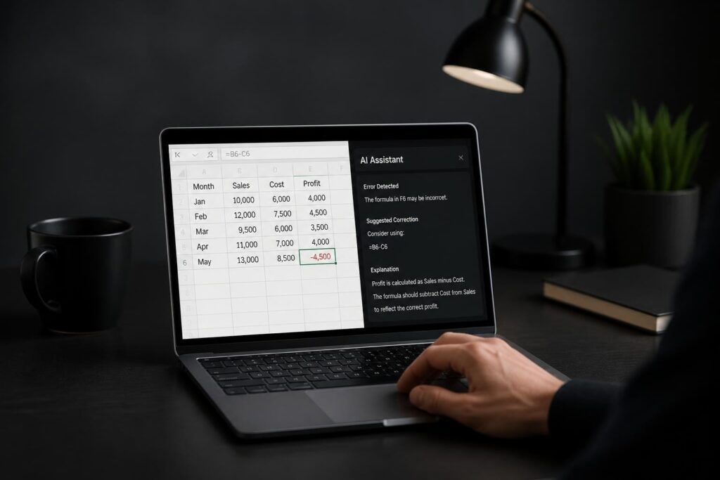
- Real-time error detection and correction
- Natural language interaction for complex tasks
For users managing complex workbooks, how to automate Excel tasks with AI provides additional context on automation possibilities. The technology has matured considerably in 2026, making sophisticated analytics accessible to users at all skill levels.

Setting Up Your AI Dashboard Environment
Before beginning your ai powered excel dashboard tutorial, you'll need the right tools configured. Microsoft Copilot for Excel represents the most integrated solution, available through Microsoft 365 subscriptions. Alternative AI assistants like Claude and ChatGPT also offer powerful dashboard capabilities through different workflows.
Choosing Your AI Platform
| Platform | Integration Level | Best For | 2026 Pricing Model |
|---|---|---|---|
| Microsoft Copilot | Native Excel integration | Enterprise users, seamless workflow | Included with Microsoft 365 Business |
| Claude AI | Add-in and external | Complex data analysis, custom solutions | Subscription-based |
| ChatGPT Plus | External with data upload | Template generation, formula assistance | Monthly subscription |
| Gemini Advanced | External collaboration | Google Sheets crossover users | Google One AI Premium |
Microsoft Copilot offers the most streamlined experience for Excel users. The Copilot Excel automation guide explains setup procedures in detail. For those comparing platforms, Claude vs Copilot for Excel provides comprehensive feature comparisons.
Preparing Your Data Source
AI tools work best with properly structured data. Your source data should follow these principles:
- Organize data in tables with clear headers
- Eliminate empty rows and columns within data ranges
- Ensure consistent data types within columns
- Remove duplicate entries that could skew analysis
- Convert data ranges to Excel Tables using Ctrl+T
Clean data accelerates AI processing and improves output quality. Most AI dashboard tools include data validation features, but starting with organized information produces superior results.
Building Your First AI Dashboard
This practical ai powered excel dashboard tutorial section demonstrates creating a sales performance dashboard using Microsoft Copilot. The process applies similarly to other AI platforms with minor variations.
Step 1: Data Import and Structuring
Begin with your raw sales data containing dates, products, regions, sales amounts, and customer information. Convert this range to an Excel Table, which enables dynamic references and automatic expansion.
Open Copilot in Excel and use this prompt: "Analyze this sales data and suggest key performance indicators for a dashboard." Copilot examines your columns and recommends relevant metrics like total revenue, average transaction value, top-performing products, and regional comparisons.
Step 2: Creating Calculated Metrics
Rather than manually writing formulas, instruct your AI assistant to generate calculations. For example: "Create a column showing month-over-month growth percentage for each product."
The AI generates the appropriate formula structure, typically using functions like:
- LAG functions for period comparisons
- SUMIFS for conditional aggregations
- AVERAGEIFS for filtered averages
- XLOOKUP for reference matching
Understanding Copilot Excel formulas examples helps you validate and modify AI-generated formulas when needed.
Step 3: Visualization Selection and Creation
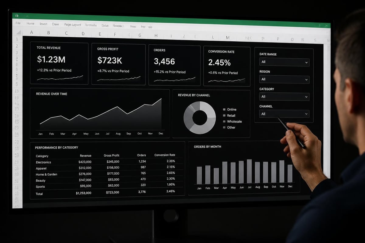
Request chart creation through natural language: "Create a column chart showing monthly revenue by region with a trend line." The AI selects appropriate chart types based on your data characteristics and dashboard purpose.
For a comprehensive sales dashboard, you might request:
- Line chart for revenue trends over time
- Pie chart for market share by product category
- Bar chart comparing regional performance
- KPI cards displaying key metrics
- Heat map showing seasonal patterns
This interactive dashboard tutorial demonstrates building a complete dashboard in approximately 10 minutes using Copilot AI, showcasing the speed advantages of AI-assisted creation.
Advanced Dashboard Features with AI
Beyond basic chart creation, AI enables sophisticated dashboard functionality that traditionally required VBA programming or advanced formula expertise.
Dynamic Filtering and Interactivity
Modern ai powered excel dashboard tutorial approaches incorporate slicers and dynamic arrays for user interaction. Instruct your AI: "Add slicers for date range, product category, and sales region that filter all dashboard elements."
The AI configures slicer connections across multiple pivot tables and charts simultaneously. This creates synchronized filtering where user selections update all dashboard components in real-time.
Advanced filtering techniques include:
- Timeline slicers for date-based filtering
- Cascading slicers where selections narrow subsequent options
- Conditional formatting responding to slicer selections
- Dynamic titles updating based on filter context
Automated Insights and Anomaly Detection
Request analytical insights: "Identify unusual patterns or anomalies in the sales data and highlight them on the dashboard." AI algorithms detect outliers, unexpected trends, and statistically significant changes.
The Claude add-in for Excel offers particularly strong analytical capabilities, providing narrative explanations of data patterns alongside visual representations.
AI can generate automated commentary such as:
- "Sales in the Northwest region declined 23% in March, the largest monthly decrease in 18 months"
- "Product Category B shows accelerating growth, up 45% quarter-over-quarter"
- "Customer acquisition costs increased while retention rates remained stable"
Performance Optimization
Large datasets can slow dashboard performance. AI tools optimize calculation efficiency through intelligent formula design. Request: "Optimize this dashboard for faster loading with 50,000+ rows of data."
The AI might recommend:
| Optimization Technique | Performance Impact | Implementation Complexity |
|---|---|---|
| Convert formulas to values for historical data | High | Low |
| Use INDEX-MATCH instead of VLOOKUP | Medium | Low |
| Implement calculated columns in Power Query | High | Medium |
| Reduce volatile functions (INDIRECT, OFFSET) | Medium | Medium |
| Consolidate duplicate calculations | High | Low |
Customizing Dashboard Design with AI Assistance
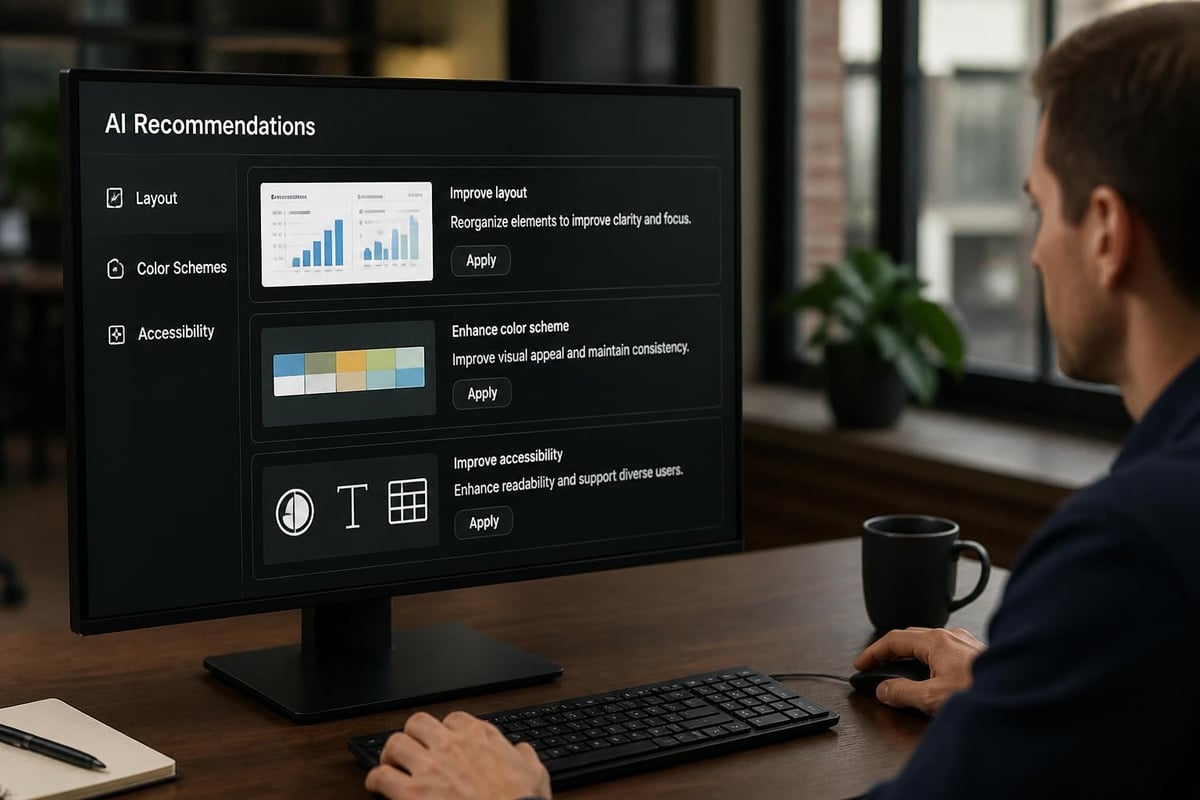
Visual design significantly impacts dashboard effectiveness. AI tools now assist with color schemes, layout optimization, and accessibility considerations.
Layout and Composition
Describe your vision: "Arrange dashboard elements in a three-column layout with KPIs at the top, trend charts in the middle, and detailed tables at the bottom." The AI suggests specific cell ranges and positioning for optimal information hierarchy.
Professional dashboard layouts follow the F-pattern or Z-pattern reading flows. AI considers these principles when recommending arrangements. For detailed guidance, building dashboards with AI tools explores design considerations alongside technical implementation.
Color Coding and Conditional Formatting
Request intelligent formatting: "Apply conditional formatting to highlight performance above target in green, within 10% of target in yellow, and below target in red." The AI generates appropriate rules with precise threshold values.
Advanced color applications include:
- Data bars for quick magnitude comparison
- Icon sets for status indicators
- Color scales for heat map effects
- Custom formats responding to multiple conditions
Accessibility and Clarity
AI helps ensure dashboards meet accessibility standards. Prompt: "Review this dashboard for colorblind accessibility and suggest improvements." The AI identifies problematic color combinations and recommends alternatives with sufficient contrast.
Text sizing, label clarity, and legend placement also benefit from AI review. The goal is dashboards that communicate effectively to diverse audiences without extensive design expertise.
Maintaining and Updating AI Dashboards
Dashboard creation represents just the beginning. Ongoing maintenance ensures continued accuracy and relevance as business needs evolve.
Automated Data Refresh
Configure automatic updates: "Set this dashboard to refresh data connections every morning at 6 AM." For dashboards connected to external data sources, scheduled refreshes maintain current information without manual intervention.
Power Query connections managed through AI can include:
- Database queries with dynamic date parameters
- Web scraping for competitive intelligence
- API connections to business systems
- Consolidated workbook references
- Cloud storage data imports
The best AI tool for Excel automation comparison helps identify platforms with robust scheduling capabilities for your specific data sources.
Version Control and Documentation
AI assists with change tracking: "Document all formulas and data sources used in this dashboard with explanations." This generates comprehensive documentation useful for troubleshooting and knowledge transfer.
Maintaining dashboard versions allows rollback if updates introduce issues. AI can compare dashboard versions and highlight differences in calculations, data sources, or visual elements.
Scaling to Multiple Dashboards
Organizations typically need multiple dashboards for different departments or purposes. AI accelerates template creation: "Create a template version of this dashboard that can be adapted for different product lines."
The AI identifies hardcoded references to replace with parameters, structures reusable components, and documents customization points. This template approach, combined with how to use Copilot in Excel, enables rapid dashboard deployment across teams.
Troubleshooting Common Dashboard Issues
Even AI-created dashboards encounter problems. Understanding common issues and their solutions prevents frustration and downtime.
Data Connection Failures
When dashboards display #REF! or #VALUE! errors, AI diagnostic prompts help: "Diagnose why this dashboard shows connection errors and suggest fixes." The AI checks data source availability, credential validity, and query syntax.
Common connection problems include:
- Changed file paths for linked workbooks
- Expired authentication tokens for cloud services
- Network restrictions blocking external queries
- Renamed sheets or tables breaking references
- Permission changes on shared data sources
Performance Degradation
Dashboards that initially loaded quickly may slow over time as data accumulates. Request: "Analyze calculation time and identify performance bottlenecks in this dashboard."
AI tools identify resource-intensive formulas, excessive conditional formatting, or inefficient data structures. The automate Excel reports with Copilot guide covers optimization strategies for maintaining responsive dashboards.
Inaccurate Calculations
When dashboard metrics don't match expected values, AI assists with formula auditing: "Trace precedents and verify calculation logic for the Total Revenue cell." This reveals formula dependencies and logic errors.
Verification steps include:
- Cross-checking totals against source data
- Testing edge cases with sample inputs
- Comparing results to previous periods
- Validating filter and slicer impacts
- Reviewing aggregation level consistency
Real-World Dashboard Applications
Understanding practical applications helps you adapt this ai powered excel dashboard tutorial to specific business contexts.
Sales and Revenue Tracking
Sales dashboards monitor pipeline health, conversion rates, quota attainment, and forecasting accuracy. AI identifies trends like: "Sales cycle length increased 12% this quarter, primarily in the Enterprise segment."
Key metrics include customer acquisition cost, lifetime value ratios, win rates by source, and territory performance comparisons.
Financial Performance Monitoring
Finance teams use dashboards for budget variance analysis, cash flow projection, and expense categorization. The AI-powered dashboard for monitoring metrics demonstrates comprehensive financial tracking implementations.
Critical financial KPIs encompass gross margin by product, operating expense ratios, working capital trends, and forecast accuracy measurements.
Operational Efficiency Metrics
Operations dashboards track production output, quality metrics, inventory turnover, and resource utilization. AI correlates variables: "Identify relationships between staffing levels, production volume, and defect rates."
Manufacturing environments benefit from real-time dashboards showing:
- Equipment downtime by machine and shift
- First-pass yield rates across production lines
- Order fulfillment cycle times
- Supply chain lead time variability
- Capacity utilization percentages
Marketing Campaign Performance
Marketing dashboards aggregate data from multiple channels to assess campaign ROI, audience engagement, and conversion funnel performance. AI recommendations might suggest: "Increase budget allocation to channels with CAC below $50 and retention above 75%."
Multi-channel tracking includes email open rates, social media engagement, website traffic sources, content performance metrics, and attribution modeling results.
Integrating External Data Sources
Modern dashboards often combine internal Excel data with external information sources for comprehensive analysis.
API Connections
Connect to business systems through APIs: "Establish a connection to Salesforce and import opportunity data for dashboard integration." AI tools generate the necessary Power Query code for authentication and data retrieval.
Popular integrations include CRM platforms, accounting systems, marketing automation tools, and e-commerce platforms. The connection setup requires API credentials but AI simplifies the technical implementation.
Web Data Extraction
Extract public web data for competitive intelligence or market research: "Scrape competitor pricing from their website daily and track changes in the dashboard." AI creates web queries with proper selectors and parsing logic.
Ethical web scraping respects robots.txt files and terms of service while gathering publicly available information for analysis.
Database Queries
Enterprise users often pull data from SQL databases. Prompt your AI: "Write a SQL query to extract last quarter's transactions from the sales database filtered by region." The AI generates optimized queries considering database structure and performance.
Direct database connections reduce manual data export/import cycles and ensure dashboard currency.
Best Practices for AI Dashboard Development
Following established practices maximizes the effectiveness of your ai powered excel dashboard tutorial implementation.
Start with Clear Objectives
Define dashboard purpose before beginning: "This dashboard will help sales managers identify underperforming territories and take corrective action within 48 hours." Clear objectives guide metric selection and design decisions.
Avoid the temptation to include every possible metric. Focus on actionable insights aligned with specific decision-making needs.
Validate AI Outputs
While AI dramatically accelerates development, always verify generated formulas and logic. Test with known data samples where you can manually calculate expected results.
Validation checklist includes:
- Spot-check formulas against manual calculations
- Test edge cases and unusual data scenarios
- Verify date arithmetic handles month/year boundaries correctly
- Confirm aggregations sum to expected totals
- Review data type handling for text, numbers, and dates
Design for Your Audience
Consider who will use the dashboard and their technical comfort level. Executive dashboards emphasize high-level KPIs with minimal detail, while analyst dashboards provide drill-down capabilities and granular data access.
AI can adapt complexity: "Simplify this dashboard for executives who need monthly summaries, not daily details." The resulting design balances comprehensiveness with usability.
Document and Train
Create user guides explaining dashboard navigation, filter usage, and metric definitions. AI assists: "Generate a user guide explaining how to use this dashboard's features."
Training ensures adoption and prevents misinterpretation of metrics. Include screenshots, step-by-step instructions, and contact information for questions.
Future Trends in AI Dashboard Technology
The landscape of AI-powered Excel dashboards continues evolving rapidly in 2026, with several emerging capabilities worth monitoring.
Natural Language Querying
Conversational interfaces allow users to ask questions directly: "Show me which products had declining sales last month." The dashboard dynamically generates appropriate visualizations without manual chart creation.
This democratizes data access, enabling non-technical users to explore information independently without Excel expertise.
Predictive Analytics Integration
AI dashboards increasingly incorporate forecasting: "Project next quarter's revenue based on current trends and seasonal patterns." Machine learning models analyze historical data to generate forward-looking insights.
Prediction intervals and confidence levels accompany forecasts, helping users understand uncertainty ranges.
Automated Narrative Generation
AI creates written summaries explaining dashboard insights: "Generate an executive summary of this month's performance highlighting notable changes." These narratives complement visual data with context and interpretation.
Automated reporting reduces the time analysts spend writing recurring reports, allowing focus on deeper analysis and recommendations.
Mastering AI-powered dashboard creation transforms how you work with Excel data, turning complex analysis into streamlined, automated processes. By combining AI capabilities with proper data structure and clear objectives, you can build professional dashboards that deliver actionable insights in a fraction of traditional development time. When you encounter challenging spreadsheet problems or need expert guidance implementing these techniques, The Analytics Doctor provides personalized Excel training and support tailored to your specific needs, helping you unlock the full potential of AI-enhanced analytics for your business.