Are you ready to unlock the full potential of your business data in 2025? In a world where data-driven decisions shape success, pivot reports have become essential for extracting powerful insights. This guide offers everything you need to master pivot reports, from foundational concepts and setup steps to advanced techniques and future-proof strategies. Discover industry best practices, avoid common mistakes, and explore the latest trends that will keep your data analysis ahead of the curve.
Understanding Pivot Reports: Foundations and Key Concepts
Pivot reports have become essential tools for businesses aiming to extract meaningful insights from their growing data. These reports transform raw data into organized, actionable formats, empowering users to analyze patterns and make informed decisions quickly. By mastering pivot reports, you unlock new levels of data clarity and control.
What Are Pivot Reports? Definitions and Core Principles
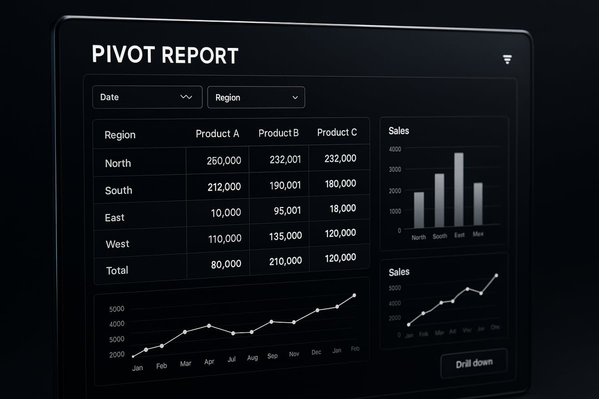
Pivot reports are interactive data summarization tools that allow users to explore and analyze large datasets efficiently. Unlike static tables, pivot reports enable dynamic grouping, filtering, and reorganization of information, making it easier to uncover trends and outliers.
Key components of pivot reports include:
- Rows: Define the categories for analysis, such as regions or products.
- Columns: Represent subcategories or time periods.
- Values: Display summarized metrics like sales totals or counts.
- Filters: Allow users to focus on specific segments of data.
For example, a sales team can use pivot reports to summarize regional sales by product, quickly identifying top performers. The main benefits are speed, flexibility, and the ability to explore data from multiple perspectives without rewriting queries or formulas. For practical, step-by-step guidance on building these reports, see How to Create PivotTables in Excel.
Essential Terminology and Structure
Understanding pivot reports requires familiarity with several key terms:
- Pivot fields: The data elements assigned to rows, columns, or values.
- Aggregation: The mathematical operation (sum, count, average) applied to values.
- Drill-down: The ability to explore deeper levels within grouped data.
- Slicers: Visual tools for applying filters interactively.
A typical pivot report structure uses numeric fields for calculations, categorical fields for grouping, and date/time fields for trend analysis. For instance, analyzing monthly sales trends involves adding a date field to columns and sales amounts to values.
Clean, well-structured data is crucial for effective pivot reports. Consistent formats, clear column names, and complete records ensure accurate and meaningful results every time.
Why Pivot Reports Matter in 2025
The significance of pivot reports is only increasing as global data volumes soar. According to IDC, worldwide data is projected to reach 175 zettabytes by 2025, making swift and flexible insights a business necessity.
Pivot reports empower organizations to make real-time decisions and conduct granular analyses, keeping them ahead of the competition. As demand for advanced reporting grows, companies that leverage pivot reports gain a strategic advantage by turning raw information into actionable intelligence.
Competitors are investing heavily in tools and platforms that enhance reporting capabilities, highlighting the critical role of pivot reports in the future of data-driven business.
Step-by-Step: Creating Your First Pivot Report
Unlocking the full power of pivot reports starts with a systematic approach. By following proven steps, you ensure your analysis is accurate, reliable, and actionable. Let’s break down the essential process so you can confidently build your first pivot report, regardless of your tool of choice.

Preparing Your Data for Pivot Analysis
Before diving into pivot reports, ensure your dataset is clean and well-structured. Start by removing duplicate entries, filling or omitting missing values, and standardizing formats across columns. Clean data is the foundation for accurate pivot reports.
Organize your data into a flat table. Each row should represent a unique record, and each column should have a clear, descriptive header. Avoid merged cells or complex hierarchies at this stage. For example, transform a raw export with scattered dates and inconsistent labels into a tidy table with columns like "Date," "Region," "Product," and "Sales."
When naming columns, use concise and consistent labels. This makes it easier to assign fields in your pivot reports and reduces errors later. Here are some best practices:
- Use short, descriptive names (e.g., "Revenue" instead of "Rev_Total_2025")
- Avoid special characters or spaces in headers
- Group related columns together for clarity
Most spreadsheet tools, such as Excel and Google Sheets, support these structures. Business intelligence tools may require you to define data types explicitly, so double-check your field formats before proceeding.
Building a Basic Pivot Report: Chronological Walkthrough
With your data prepared, you’re ready to create your first pivot report. Follow these steps for a smooth experience:
- Select your data range. Highlight the cells containing your cleaned dataset.
- Insert a Pivot Table/Report. In Excel, go to Insert > PivotTable. In Google Sheets, choose Data > Pivot table.
- Assign fields to areas. Drag "Product" to Rows, "Quarter" to Columns, and "Sales" to Values. This setup summarizes sales by product and quarter.
- Apply filters and sorting. Add a filter for "Region" to focus on specific markets. Sort values to highlight top performers.
- Adjust aggregation functions. By default, values are summed. Change to average or count as needed by right-clicking the value in Excel or using the dropdown in Google Sheets.
Here’s a sample scenario using pivot reports:
| Date       | Region | Product | Sales |
|------------|--------|---------|-------|
| 2025-01-01 | West   | Widget  | 1000  |
| 2025-01-01 | East   | Gadget  | 750   |
After building your pivot report, you instantly see total sales by product and region, enabling quick insights.
Customizing Layout and Formatting
Customizing your pivot reports enhances readability and impact. Rearranging fields can clarify your analysis, such as moving "Region" above "Product" to group data by geography first.
Format numbers, dates, and percentages for clarity. For example, display sales as currency and dates in a consistent format. Add subtotals or grand totals to highlight overall performance.
Conditional formatting helps you spot trends or outliers instantly. For a detailed walkthrough, consult the Excel Conditional Formats Guide, which explains key techniques for highlighting high or low performers.
Consider these customization tips:
- Use color scales to emphasize top results
- Bold key metrics for quick reference
- Apply filters to isolate specific segments
A visual example: highlight the top three products by sales with a bold color, making them stand out for stakeholders.
With these customization strategies, your pivot reports become not just functional, but visually compelling and easy to interpret.
Advanced Pivot Report Techniques for Power Users
Unlocking the full power of pivot reports requires moving beyond the basics. Advanced users apply strategic grouping, dynamic controls, custom calculations, and rich visualizations to extract deeper insights. Mastering these techniques transforms static data into a responsive decision-making tool.
Multi-Level Grouping and Nested Analysis
Multi-level grouping is a hallmark of expert pivot reports. By organizing data into hierarchies, you can drill down from broad overviews to granular details. For example, start by grouping sales data by region, then by salesperson, and finally by product. This approach reveals patterns that single-level summaries might miss.
To implement nested analysis:
- Drag multiple fields into the rows or columns section.
- Arrange fields in a logical order for meaningful drill-downs.
- Use subtotal options to highlight intermediate results.
Suppose you want to analyze customer retention. Group by region first, then by customer segment, and finally by year. This nested view lets you compare retention trends across regions and segments at once. Remember, clean data and clear field naming are vital for accurate pivot reports.
Calculated fields further refine your analysis. Create custom metrics, such as retention rates or average deal sizes, using built-in formulas. These advanced functions set your pivot reports apart from standard tables, providing actionable insights tailored to your business context.
Filtering, Slicers, and Dynamic Controls
Filtering and slicers give users interactive control over pivot reports. Filters allow you to focus on specific data subsets, while slicers create intuitive, clickable buttons for real-time analysis. Both tools enhance the user experience, but each serves a unique purpose.
| Feature | Filters | Slicers |
|---|---|---|
| Location | Above report | On report surface |
| Use | Multi-field, static | Visual, interactive |
| Best for | Power users | All users |
To add a slicer:
- Select your pivot table.
- Choose "Insert Slicer" and pick a field, such as department or time period.
- Adjust slicer style for clarity and visibility.
Best practices include limiting the number of slicers to avoid clutter and ensuring each slicer is clearly labeled. For dashboards, slicers make it easy for managers to focus on their department or compare performance across time frames. This dynamic filtering is essential for responsive pivot reports.
Calculated Fields and Advanced Aggregations
Calculated fields unlock the ability to create new metrics directly within pivot reports. Instead of relying solely on sum or count, you can define formulas for complex business questions. For example, to calculate profit margin, add a calculated field with the formula =(Revenue-Cost)/Revenue.
Advanced aggregations go further:
- Use weighted averages to account for volume differences.
- Apply calculated items for category-level metrics.
- Nest calculations for multi-step analysis.
Suppose your sales data includes both revenue and units sold. You can create a calculated field for average selling price, then add another field for growth rate versus the previous quarter.
Always verify your formulas and check field placements. Misplaced calculated fields can lead to incorrect results, especially in large pivot reports. Testing with sample data helps ensure accuracy before sharing findings.
Visualizing Pivot Data: Charts and Dashboards
Turning pivot reports into visual dashboards amplifies their impact. Visualizations make trends and outliers obvious at a glance. Pivot charts are built directly from your data—they update automatically as you filter or drill down.
Common visualization options include:
- Column and bar charts for comparisons
- Line charts for trends over time
- Pie charts for proportions
- Combo charts for multi-metric analysis
When embedding pivot reports into dashboards, consider layout and interactivity. Use conditional formatting to spotlight key metrics, and combine multiple charts for a comprehensive view. For step-by-step dashboard integration, explore Excel Dashboard Creation to streamline your workflow.
Mobile-optimized dashboards allow executives to review pivot reports on the go, ensuring decision-makers always have access to the latest insights. By connecting charts and reports, you provide a dynamic, engaging experience for every stakeholder.
Integrating Pivot Reports with Other Data Tools
Unlocking the full value of pivot reports often means connecting them seamlessly with other business tools. Integration ensures your insights are timely, actionable, and widely accessible. Let’s explore how you can export, automate, and embed pivot reports for maximum impact.
Exporting and Sharing Pivot Reports
Sharing pivot reports efficiently is vital for team collaboration and stakeholder communication. Export options typically include PDF, Excel, and direct cloud uploads. These formats make it easy to distribute insights without compromising data integrity.
Modern BI platforms enable automated report delivery. For example, you can schedule weekly pivot reports to be sent directly to your leadership team via email or cloud links. Automation reduces manual effort and ensures everyone stays updated.
Collaboration features have advanced, allowing multiple users to comment or co-edit reports in real time. Tools like Power BI now offer enhanced integration and sharing capabilities, as detailed in What’s New in Power BI Collaboration and Integration. These innovations help teams work together seamlessly, further extending the reach and impact of pivot reports.
Connecting to Live Data Sources
For meaningful, up-to-date analysis, pivot reports should be connected to live data sources. Integration with databases, APIs, or cloud services lets you analyze fresh information as soon as it’s available. This approach is key for businesses needing rapid, data-driven decisions.
Live connections support real-time insights, enabling analysts to react instantly to market changes. For instance, linking pivot reports to your CRM or sales database allows you to monitor sales trends by the hour. This dynamic access is especially valuable in fast-paced industries.
Security and access controls are essential when connecting live data. Always ensure proper authentication and permission settings are in place. This keeps sensitive information safe while empowering users to explore data confidently with pivot reports.
Embedding Pivot Reports in Business Applications
Embedding pivot reports within business applications makes insights accessible where they matter most. You can place reports into web portals, intranet sites, or client dashboards, tailoring the experience to each audience.
Modern tools allow you to customize user permissions, controlling who can view, filter, or interact with specific data. This ensures compliance while keeping reports interactive and relevant. For example, a client-facing dashboard powered by embedded pivot reports can give customers real-time updates on their account metrics.
By integrating pivot reports directly into business workflows, organizations enhance decision-making and create a more data-driven culture. Embedded analytics bridges the gap between analysis and action, making powerful insights available at the point of need.
Common Pitfalls and How to Avoid Them
Even the most powerful pivot reports can fall short if you overlook common pitfalls. Inconsistent data, misapplied calculations, and overly complex layouts can undermine your analysis. Let us explore the typical challenges and actionable solutions to ensure your pivot reports remain accurate, clear, and scalable.
Data Quality and Consistency Issues
Data quality is the backbone of effective pivot reports. If your data contains inconsistent formats, missing values, or duplicate entries, your insights will be unreliable.
Common problems include:
- Inconsistent date or number formats
- Blank or incomplete rows
- Duplicate records
These issues can skew your totals, averages, and visualizations. Regular validation and cleaning are essential. Automated solutions, such as those described in Auto-Prep: Holistic Prediction of Data Preparation Steps, can help predict and address preparation steps for business intelligence, streamlining the process for pivot reports.
Misinterpreting Aggregations and Totals
A frequent pitfall in pivot reports is misunderstanding how aggregation functions work. For example, using a sum instead of a count can dramatically alter your analysis.
Consider these scenarios:
- Summing sales transactions when you meant to count orders
- Averaging values without accounting for missing entries
- Placing fields in the wrong area, leading to double-counting
Always verify your calculations and review field placements. Test your pivot reports by cross-checking results with original data to avoid costly mistakes.
Overcomplicating Reports and User Experience
Adding too many fields, filters, or nested groups can make pivot reports overwhelming and difficult to interpret. When reports are cluttered, users may miss key insights.
Strategies to simplify include:
- Focusing on actionable metrics
- Limiting the number of visible fields
- Using clear labels and logical grouping
Leverage resources like Excel Templates for Reports to streamline setup and formatting. Well-designed templates help you keep pivot reports user-friendly and effective.
Performance and Scalability Challenges
Large datasets can slow down pivot reports, causing long refresh times or memory errors. As data volumes grow, performance becomes a critical concern.
To address this:
- Use data sampling for initial analysis
- Pre-aggregate data where possible
- Consider cloud-based BI tools for better scalability
Responsive and scalable reporting is vital for 2025 and beyond, ensuring your pivot reports deliver fast, reliable insights even as your business grows.
Pivot Report Trends and Innovations for 2025
The landscape of pivot reports is rapidly transforming as we approach 2025. New technologies and user expectations are reshaping how organizations analyze and act on their data. Let us explore the key trends and innovations that will define the next era of pivot reports.
AI and Automation in Pivot Reporting
AI is revolutionizing pivot reports by automating complex analysis and surfacing hidden insights. Tools now leverage machine learning to recommend optimal pivot configurations and detect anomalies in real time. With AI, users can generate new reports by referencing existing data, streamlining the entire reporting process. This approach is detailed in ReSpark: Leveraging Previous Data Reports, which explores how large language models enhance efficiency in report creation.
Automated trend analysis and smart suggestions are empowering users to uncover actionable patterns faster than ever. As AI becomes more embedded, pivot reports will deliver even greater value with minimal manual effort.
Real-Time and Predictive Analytics Integration
Modern pivot reports are moving beyond historical data. They now connect to streaming sources, enabling real-time analysis and instant updates. This integration allows businesses to monitor key metrics as events unfold, driving timely decisions.
Predictive analytics is also becoming standard. By applying statistical models to pivot reports, organizations can forecast trends and prepare for future shifts. For example, sales teams can use historical pivot data to predict upcoming demand and adjust strategies proactively.
Enhanced Collaboration and Cloud-Based Reporting
Collaboration is essential for effective data analysis. Cloud-based pivot reports enable teams to work together from anywhere, offering real-time co-editing and instant sharing. Multiple users can view, comment, and refine reports simultaneously, ensuring everyone stays aligned.
Integration with cloud BI platforms simplifies access to up-to-date information. Teams can embed pivot reports within dashboards, track changes, and automate report delivery. This connected workflow keeps insights flowing across the organization.
Mobile-First and Responsive Pivot Reports
The mobile workforce demands access to insights on any device. Pivot reports are evolving with responsive designs that adapt to smartphones and tablets. Executives and managers can now review metrics, filter data, and interact with dashboards while on the move.
Touch-friendly controls and adaptive layouts ensure a seamless experience. Whether in a meeting or traveling, decision-makers can rely on pivot reports to stay informed and agile.
Data Privacy and Security Enhancements
With growing volumes of sensitive information, data privacy in pivot reports is paramount. New compliance standards require robust permission controls and built-in audit trails. Modern tools allow organizations to restrict access to specific fields and track user activity.
Security features such as encryption, multi-factor authentication, and role-based access help protect confidential data. These enhancements ensure that pivot reports remain trustworthy and compliant as regulations evolve.
Future Outlook: The Evolving Role of Pivot Reports
The future of pivot reports is dynamic and bright. We will see broader integration with AI-driven insights, increased automation, and tighter alignment with business decision workflows. As highlighted in Beyond Visualization: Building Decision Intelligence, iterative dashboard refinement will play a key role in enhancing the impact of pivot reports.
Expect tools to become even more user-centric, offering advanced features without sacrificing simplicity. Pivot reports will continue to adapt, meeting the evolving needs of organizations in a fast-paced, data-driven world.