Are you overwhelmed by endless spreadsheets, struggling to find insights in a sea of numbers? You are not alone. Knowing how to create excel dashboards can turn raw data into clear, interactive visuals that drive better decisions. In this essential 2026 guide, you will learn the proven steps to transform your data into dashboards that impress stakeholders and make your reports stand out. Discover best practices, expert tips, and advanced techniques designed for real-world results. By the end, you will feel confident and ready to master how to create excel dashboards that truly make an impact.
Understanding Excel Dashboards: Definitions, Benefits, and Use Cases
Struggling to figure out how to create excel dashboards that truly make your data come alive? Understanding what sets dashboards apart from ordinary reports is the first step. Let’s break down what an Excel dashboard is, why it matters, where it’s used, and what makes it effective.
What Is an Excel Dashboard?
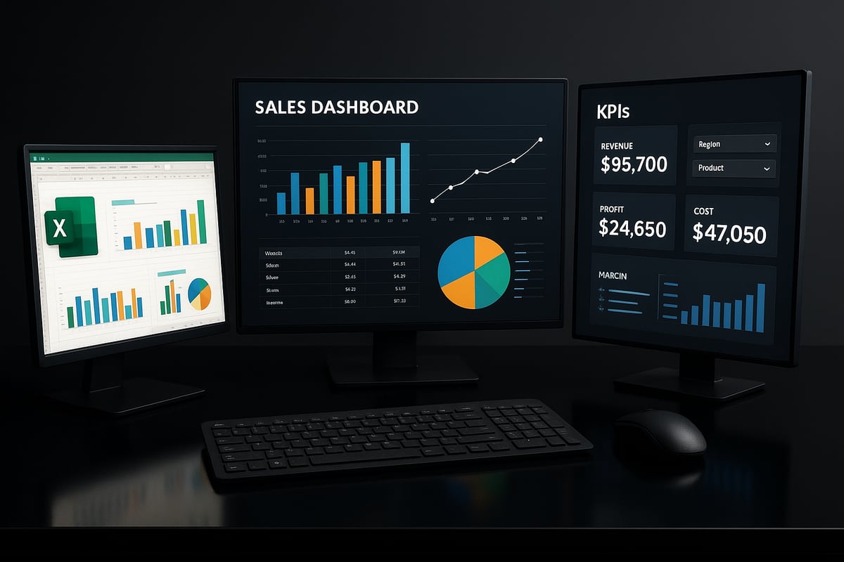
An Excel dashboard is an interactive, visual summary of key data points, designed for quick analysis and decision-making. Unlike static reports, dashboards combine charts, tables, KPIs, and slicers into a single view, allowing users to explore data in real time.
When you learn how to create excel dashboards, you’re building tools that can track sales, monitor finances, or manage operations all from one place. For example, a sales dashboard may feature monthly revenue charts, while a finance dashboard highlights expense breakdowns and profitability.
Dashboards focus on actionable insights, pulling together the most important information for fast, informed decisions.
Why Use Dashboards in Excel?
Why do so many professionals want to know how to create excel dashboards? The answer lies in their power to deliver real-time insights, streamline reporting, and save valuable time.
According to Microsoft’s 2024 survey, 67% of businesses rely on dashboards for daily reporting. Dashboards help everyone, from analysts to executives, access and interpret data without technical barriers. They’re easy to update, share, and customize, making them ideal for teams of all skill levels.
By turning raw data into clear visuals, dashboards empower faster, smarter decisions in any industry.
Common Business Use Cases
Wondering where to start with how to create excel dashboards? Start by identifying your business needs. Dashboards shine in sales performance tracking, financial summaries, and project management.
For instance, sales teams use dashboards to monitor targets and identify trends. Finance departments summarize budgets and expenses, while project managers track milestones and resources. As remote and hybrid work grows, dashboards keep teams aligned, making information accessible from anywhere.
The adoption of dashboards is accelerating, helping organizations communicate results quickly and clearly.
Key Features of Effective Dashboards
If you’re learning how to create excel dashboards, focus on clarity, minimalism, and actionable information. An effective dashboard uses color, layout, and interactivity to guide users’ attention to what matters most.
Keep your design simple, avoid clutter, and use automation for data refresh to minimize errors. For more guidance, check out these Excel Dashboard Best Practices, which cover proven strategies for creating dashboards that engage users and drive results.
Automated data updates and error reduction are essential, ensuring your dashboard remains accurate and reliable for every decision.
Preparing Your Data: Laying the Foundation for a Successful Dashboard
Before you can master how to create excel dashboards, you need to start with reliable, well-structured data. Proper preparation ensures your dashboards are accurate, fast, and easy to maintain. Let’s break down the core steps to lay a solid foundation for your dashboard project.
Data Collection and Organization
Every effective dashboard starts with trusted data sources. When learning how to create excel dashboards, identify where your data comes from, such as internal databases, CSV exports, or external APIs.
Consistency is vital. Ensure all data follows the same formats, especially for dates, currencies, and categories. For example, if you track sales, use a single date format and standard currency throughout your records.
Organize your data logically. Store raw and processed data on separate sheets for clarity. This approach not only streamlines updates but also makes troubleshooting far easier.
- Internal databases
- CSV or TXT files
- Live API feeds
Proper organization is the first step to a dashboard that delivers clear insights.
Data Cleaning and Validation
Data quality issues can derail your dashboard project. In how to create excel dashboards, always address duplicates, missing values, and inconsistencies before analysis.
Use Excel’s built-in tools like Remove Duplicates and Data Validation to streamline this process. Data cleaning can save up to 30 percent of overall dashboard development time, according to industry reports.
For a comprehensive approach, follow best practices outlined in resources like the Excel Data Validation Rules and Checks. These methods help you automate checks and maintain high data integrity.
A clean dataset builds trust in your dashboard and ensures your results are both reliable and actionable.
Structuring Data for Analysis
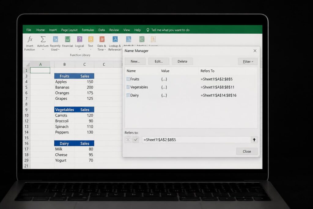
How you structure your data has a direct impact on how to create excel dashboards efficiently. Always use Excel tables and named ranges to keep your data organized and easy to reference.
Normalized layouts, such as long format tables, are best for pivot tables and advanced analysis. This format makes it simple to add new data without breaking formulas or charts.
For example, transform a sales log from a wide format (one column per month) to a long format (one row per transaction) for easier trend analysis.
- Use structured tables
- Apply named ranges
- Prefer long format for analysis
Proper structure ensures your dashboard remains scalable and flexible as your needs evolve.
Data Refresh and Automation Best Practices
To maximize efficiency in how to create excel dashboards, leverage Excel’s automation features. Power Query allows you to import and transform data quickly, while automatic refresh options keep your dashboards up to date with minimal manual effort.
Connect live data sources whenever possible. This approach not only saves time but also reduces manual errors and ensures stakeholders always see the latest insights.
Automating routine tasks leaves you free to focus on analysis, not data wrangling. Set up scheduled refreshes and link your dashboard to real-time feeds for the best results.
A well-automated dashboard is both reliable and future-proof.
Step-by-Step Guide: How to Create an Excel Dashboard from Scratch
Building a dashboard may seem daunting, but mastering how to create excel dashboards is within reach when you follow a clear process. This step-by-step guide will walk you through every stage, from defining goals to sharing your final, interactive dashboard. Each step is designed to help you transform raw data into a powerful business tool.
Step 1: Define Your Dashboard Goals and Audience
The first step in how to create excel dashboards is to clarify your objectives. Ask yourself, what questions should the dashboard answer? Pinpoint the key metrics that matter most for your specific business case.
Identify your stakeholders early. For example, a sales manager may need monthly trends, while a CEO might focus on high-level KPIs. Understanding your audience ensures the dashboard remains relevant and actionable.
List your primary goals and keep them visible as you work. This focus will guide your decisions throughout the dashboard creation process.
Step 2: Design Your Dashboard Layout
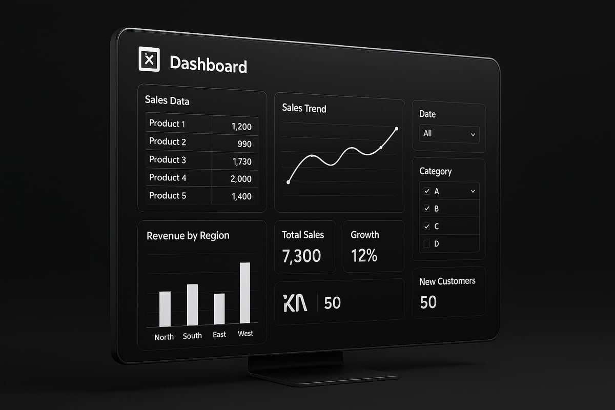
With your goals in mind, plan the layout for your dashboard. Sketch wireframes on paper or use Excel templates to visualize the structure. The layout should follow a logical flow, grouping related metrics together and leaving enough white space for clarity.
Consider placing key KPIs at the top, with detailed charts and breakdowns below. Use this simple table as a planning tool:
| Section | Content Example |
|---|---|
| Top | KPIs (Total Sales, Growth) |
| Middle | Trend Charts, Comparisons |
| Bottom | Detailed Tables, Filters |
A thoughtful layout is essential in how to create excel dashboards that are easy to navigate and understand.
Step 3: Import and Structure Your Data
Next, bring your data into Excel. You can import data from tables, use Power Query, or connect to external sources. Keep your data organized on dedicated sheets, such as a "Raw Data" sheet separate from the "Dashboard" sheet.
Ensure data is structured for analysis. Use Excel tables for dynamic range management and easier referencing. Consistent naming conventions and clear separation of raw and processed data will help you avoid confusion as you build.
A well-organized data foundation is crucial for anyone wanting to learn how to create excel dashboards efficiently.
Step 4: Build Key Metrics and Calculations
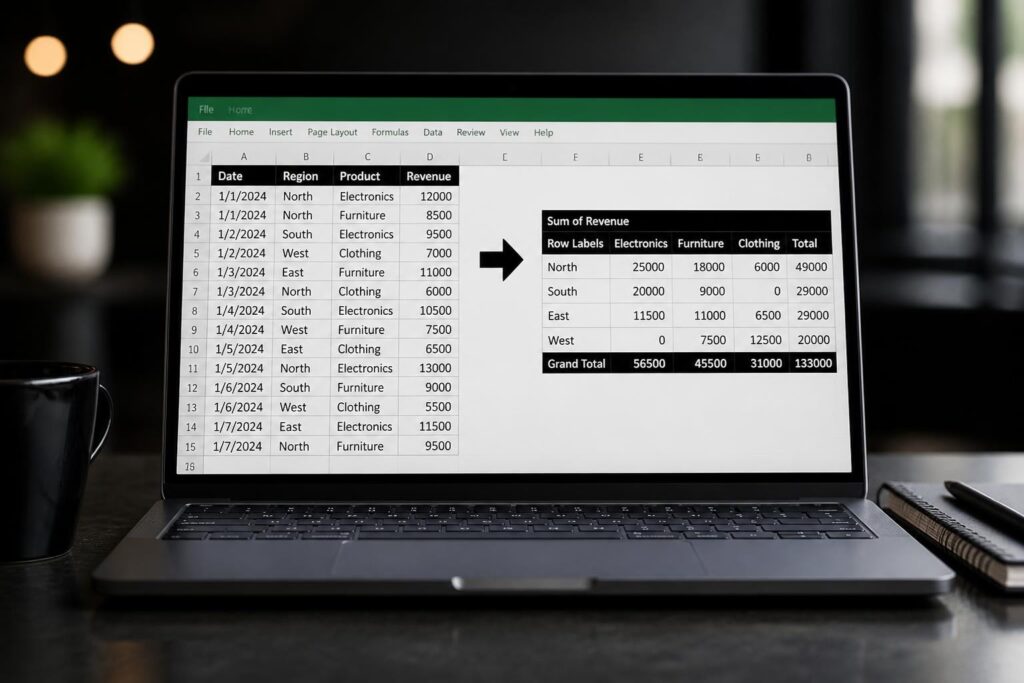
Now, start building the calculations that will drive your dashboard insights. Use formulas like SUMIFS, AVERAGEIFS, and COUNTIFS for targeted summaries. Pivot tables are essential for grouping and summarizing large datasets quickly.
For example, to calculate monthly sales growth, try this formula:
=(CurrentMonthSales - PreviousMonthSales) / PreviousMonthSales
Dynamic named ranges help your calculations update as new data arrives. For a deeper dive into creating robust pivot tables, visit How to Make Excel Pivot Table.
Mastering this step is central to how to create excel dashboards that deliver actionable insights.
Step 5: Create Visualizations (Charts, Tables, KPIs)
Bring your data to life with effective visualizations. Select the right chart type for each metric—column charts for trends, pie charts for proportions, and sparklines for quick snapshots. Insert and format charts for maximum clarity.
Use conditional formatting to highlight KPIs, such as turning cells green for targets met and red for those missed. This visual cue immediately draws attention to important results.
For example, display a year-over-year sales chart with a trendline to show progress. Visual impact is a key component of how to create excel dashboards that engage and inform.
Step 6: Add Interactivity (Slicers, Dropdowns, Buttons)
To make your dashboard interactive, add slicers for filtering pivot tables by categories like region or product. Use form controls to create dropdown menus and buttons, allowing users to customize their views.
Link these controls to dashboard elements for real-time updates. For instance, a user can select a region from a dropdown, and all related charts will instantly adjust.
Interactivity turns static reports into dynamic tools, making how to create excel dashboards a skill that empowers users to explore data on their own.
Step 7: Polish, Test, and Share Your Dashboard
Before sharing, refine your dashboard’s appearance. Apply a consistent color scheme, align elements, and use readable fonts. Test usability by asking sample users for feedback—ensure calculations are correct and navigation is intuitive.
Protect sensitive data by locking cells and providing clear instructions for end users. Consider sharing options: Excel Online for collaboration, PDF export for static reports, or integration with Microsoft Teams for remote access.
A polished and tested dashboard is the final step in how to create excel dashboards that stakeholders will trust and rely on for decision-making.
Advanced Excel Dashboard Techniques for 2026
Mastering how to create excel dashboards means adopting the latest techniques that deliver speed, automation, and flexibility. In this section, you will discover advanced tools and strategies that elevate your dashboards from basic to business-critical. Each approach below will help you unlock deeper insights and streamline your reporting process.

Leveraging Power Query and Power Pivot
To truly excel at how to create excel dashboards, you need robust tools for managing and modeling data. Power Query simplifies importing, cleaning, and transforming information from diverse sources. Power Pivot enables building complex data models, allowing for fast analysis of large datasets.
With Power Query, automate data refreshes and eliminate repetitive manual tasks. Power Pivot supports relationships between tables and advanced calculations using Data Analysis Expressions (DAX). For a comprehensive workflow, explore Power Pivot and Data Modeling in Excel to learn how to build scalable, error-proof dashboards.
Using Dynamic Arrays and Advanced Formulas
The introduction of dynamic arrays has revolutionized how to create excel dashboards. Functions like FILTER, SORT, UNIQUE, and SEQUENCE make it possible to build dashboards that update automatically as new data arrives.
For example, use =FILTER(SalesData, Region="West") to instantly display only relevant records. Combine with conditional formatting to highlight top performers. These formulas reduce manual updates and ensure your dashboard always reflects the latest insights.
Enhancing Interactivity with Macros and VBA
If you want to take how to create excel dashboards to the next level, automation is key. Macros and VBA scripts let you automate repetitive tasks such as refreshing data, generating reports, or exporting dashboard views as PDFs.
Create custom buttons that allow users to filter data, reset views, or trigger calculations. For example, a VBA script can export the dashboard to a formatted PDF with a single click, making sharing insights effortless and efficient.
Real-Time Data Integration
Staying ahead with how to create excel dashboards means connecting to live data sources. Excel allows integration with SQL databases, APIs, and cloud-based apps. Power Query can be set up to pull real-time updates, ensuring your dashboard provides up-to-the-minute reporting.
A real-time dashboard is crucial for scenarios like monitoring sales, tracking inventory, or following stock prices. This level of integration minimizes lag, reduces errors, and keeps stakeholders informed with the latest information.
Mobile-Friendly and Cloud-Based Dashboards
Modern business requires flexibility, so knowing how to create excel dashboards that work on any device is essential. Optimize your dashboard layout for mobile use by simplifying visuals and using responsive design principles.
Leverage Excel Online, Office 365, and OneDrive to share dashboards instantly with remote or hybrid teams. Real-time collaboration means everyone can access and interact with the dashboard, whether they are in the office or on the go.
Security, Permissions, and Version Control
Data security is a top priority when you learn how to create excel dashboards. Use Excel’s password protection, restricted access, and sheet locking features to safeguard sensitive information.
Implement version control by saving iterations and tracking changes. This ensures accountability and allows you to roll back to previous versions if needed. For financial dashboards, maintain audit trails so all edits are documented and transparent.
Best Practices and Common Mistakes to Avoid
Creating high-impact dashboards requires more than technical skill. Knowing how to create excel dashboards that are clear, efficient, and user-friendly is essential for driving business results. By following proven best practices and steering clear of common pitfalls, you set yourself up for dashboard success.
Dashboard Design Best Practices
When learning how to create excel dashboards, simplicity and focus should always lead your design choices. Keep the layout clean, using consistent color schemes and fonts for a polished look. Limit the number of visuals to avoid overwhelming users.
- Place key metrics at the top for quick insights.
- Use white space to separate sections and improve readability.
- Rely on intuitive chart types for data storytelling.
Leverage conditional formatting to highlight trends and anomalies. For a detailed walkthrough, see the Excel Conditional Formats Guide. Always align dashboard elements for a professional finish.
Common Mistakes and How to Fix Them
Even experienced users can stumble when figuring out how to create excel dashboards. Overcomplicating visuals with too many charts, inconsistent colors, or unclear labels can confuse your audience.
- Avoid using excessive pie charts or 3D effects.
- Test your dashboard with real users before rollout.
- Clearly label every chart and metric.
If your dashboard feels cluttered, remove non-essential elements. For more examples of what to avoid and how to correct errors, review Supply Chain Dashboard Templates 2026, which highlights common pitfalls and practical solutions.
Performance Optimization Tips
A dashboard should load quickly and respond smoothly. When you plan how to create excel dashboards, minimize the use of volatile formulas like INDIRECT or OFFSET, which slow down performance.
- Replace array formulas with pivot tables where possible.
- Limit the use of complex conditional formatting.
- Keep data structures tidy for faster calculations.
Efficient dashboards not only save time but also reduce the risk of errors. Regularly review your formulas and data sources to maintain optimal performance, especially as your datasets grow.
Ensuring Accessibility and Usability
To master how to create excel dashboards for all users, prioritize accessibility and clear navigation. Use color palettes with high contrast and ensure text is easy to read.
- Add instructions and tooltips for guidance.
- Design layouts that support keyboard navigation.
- Use descriptive titles and alt text for visuals.
Accessible dashboards empower every stakeholder, regardless of technical skill. By making usability a core focus, you ensure your insights are actionable and inclusive for everyone.
Excel Dashboard Resources, Templates, and Learning Paths
Unlocking the full potential of Excel dashboards begins with the right resources. Whether you are just starting out or looking to level up, having access to quality templates and learning paths is essential for mastering how to create excel dashboards.
Recommended Templates and Tools
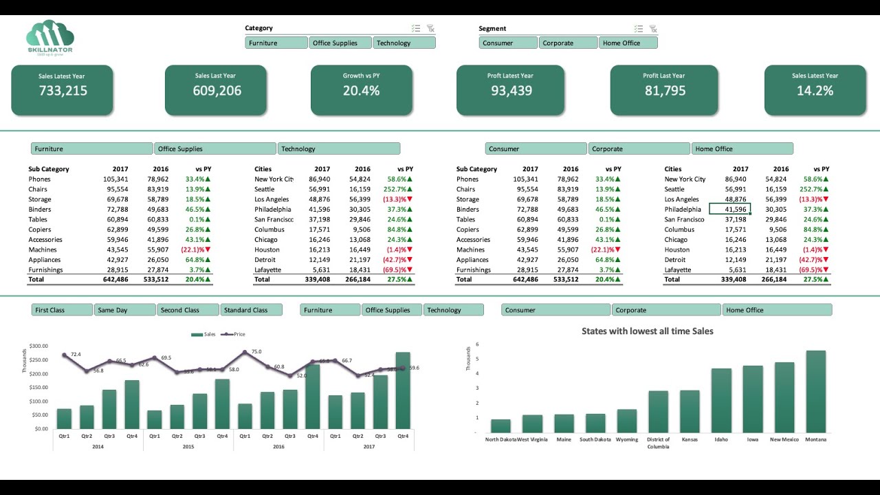
Starting with the right template can make all the difference when learning how to create excel dashboards. Microsoft offers a wide range of built-in templates, including their popular Sales Dashboard, which provides a solid foundation for customization.
You can also explore these top sources for both free and premium templates:
- Microsoft Office Templates: Search the Excel template gallery for dashboards tailored to sales, finance, and project tracking.
- Vertex42: Renowned for its high-quality, user-friendly templates suitable for various business needs.
- Spreadsheet123: Offers a selection of clean, professional dashboard templates.
Experimenting with different templates helps you understand structure and formatting best practices, making your dashboard creation process more efficient.
Excel Training and Support Options
To truly master how to create excel dashboards, invest in continuous learning and community support. Online platforms like LinkedIn Learning and Coursera offer in-depth courses covering dashboard techniques, interactivity, and visualization.
For troubleshooting and peer advice, join forums such as Reddit’s r/excel and MrExcel, where you can exchange ideas and solve challenges with fellow users. For those interested in refining their dashboards over time, the Iterative Dashboard Refinement Study presents a structured methodology for ongoing improvement and business intelligence success.
Staying current with new Excel features and participating in communities ensures you keep your dashboard skills sharp and adaptable.