Ever opened a fresh Excel workbook and felt that mix of excitement and dread because you need a solid project plan but have no template in sight? You’re not alone.
Most of us have stared at a blank grid, wondering how to line up tasks, deadlines, and resources without ending up with a messy list that no one can follow. That’s where a well‑crafted project plan template in Excel steps in like a trusted sidekick.
Think about a marketing launch you ran last year. You jotted down tasks on sticky notes, then tried to shuffle them in a Word document. The result? Missed deadlines and a frantic scramble. If you had a template that automatically rolls dates forward when you adjust the start date, those headaches disappear.
A good template does three things: it visualizes the timeline, it consolidates responsibilities, and it calculates budget impact on the fly. For example, you can set up a column with =WORKDAY(start_date, duration) to auto‑populate finish dates, and a SUMIFS that tallies hours per team member.
Ready to build your own? Start with these steps:
- Define phases (initiation, planning, execution, closure) and list them in column A.
- Add columns for Owner, Start Date, Duration (days), End Date (formula), Status.
- Insert conditional formatting to turn tasks green when Status = “Complete”.
- Use a simple Gantt bar chart that references Start Date and Duration.
If you prefer a shortcut, grab a pre‑made sheet that already has those formulas and formatting baked in. Our Excel for Project Management guide walks you through customizing a template for any industry, from software sprints to event planning.
Pro tip: keep a master copy in OneDrive, then use ‘Save As’ for each new project. That way you preserve the formulas and avoid accidental overwrites.
And remember, the template is only as good as the data you feed it. Spend a few minutes each week updating progress, and the spreadsheet becomes a live command center rather than a static document.
So, does a project plan template in Excel sound like the missing piece for your next initiative? Give it a try, tweak the columns to match your workflow, and watch the chaos turn into clarity.
TL;DR
A project plan template Excel turns chaotic task lists into a live, auto‑updating roadmap, letting you see dates, owners, and progress at a glance.
Just copy the sheet, set your phases, tweak columns, and watch the spreadsheet keep everyone aligned without endless manual updates, daily, quickly, effortlessly, and with fuss.
Step 1: Define Project Goals and Scope
Okay, picture this: you’ve just opened a fresh Excel workbook and you can already feel the mental chatter—‘What am I actually trying to achieve here?’ That moment of uncertainty is the exact reason we start with crystal‑clear goals and a tight scope. Without them, even the smartest project plan template excel will feel like a maze.
First thing’s first—ask yourself what success looks like. Are you aiming to launch a new product in 90 days, or simply keep a quarterly marketing calendar on track? Write that vision down in one sentence. It forces you to cut through the fluff and land on something you can measure.
Turn vague ideas into SMART goals
SMART goals (Specific, Measurable, Achievable, Relevant, Time‑bound) aren’t just buzzwords; they’re the backbone of any solid project plan. A goal‑setting template can help you lay out each piece without reinventing the wheel. For example, instead of “improve reporting,” try “reduce monthly report preparation time from 8 hours to 4 hours by implementing automated Excel formulas by June 30.” See the difference? You’ve got a clear metric, a deadline, and a realistic path.
Grab a blank sheet in your Excel template, add columns for Goal, Owner, Metric, Target Date, and Status. Fill them in as you brainstorm. This tiny table becomes the north star that guides every task you later add.
Scope it out before you dive in
Scope is the “what’s in” and “what’s out” of your project. A good way to start is to list every deliverable you think you need—maybe a Gantt chart, a risk register, or a stakeholder communication plan. Then, ask yourself: which of these are truly essential for the goal you just defined?
Smartsheet’s collection of project scope templates shows how you can break down scope into high‑level objectives, assumptions, constraints, and milestones. Translate that structure into Excel: create a “Scope” tab, add rows for each deliverable, and a column that flags “Must‑Have” vs. “Nice‑to‑Have.” This visual checklist keeps scope creep at bay.
Here’s a quick checklist you can copy into your template:
- Define the primary objective (the SMART goal you just wrote).
- List all deliverables needed to hit that objective.
- Mark each deliverable as core or optional.
- Identify assumptions (e.g., “team has access to Power Query”).
- Note constraints (budget, timeline, resource limits).
When you’re done, you should be able to answer: “If we only completed the ‘must‑have’ items, would we still achieve the goal?” If the answer is yes, you’ve nailed your scope.
Make it visual—and a little fun
People retain visual info better than text blocks, so add a simple diagram or flowchart to your Excel file. Even a hand‑drawn sketch scanned in works. It reinforces the connection between goal, scope, and the tasks that will follow.
And because we’re talking about making things feel human, sprinkle in a short video that walks through setting goals in Excel. It doesn’t have to be a production—just you, a screen, and a friendly voice. Here’s an embed you can drop straight into your guide:
Watch it, pause, and follow along in your own workbook.
One last tip: treat your goal‑and‑scope section as a living document. Revisit it after the kickoff meeting and after any major change request. Update the status column, tweak assumptions, and you’ll keep the entire team aligned without endless email threads.

Step 2: Set Up Timeline and Milestones
Create a clean timeline table
First, pop open a fresh sheet next to the Goal & Scope tab you just built. In column A, list every task or deliverable you uncovered in step 1 – think “Draft creative brief,” “Secure vendor quotes,” “Run QA test.”
Next to each task, add columns for Owner, Start Date, Duration (in days), and an End Date formula like =WORKDAY(C2,D2-1) so Excel rolls the finish date for you. A quick Status drop‑down (Not Started, In Progress, Complete) gives you a one‑click way to flag progress.
Does that feel a bit too “spreadsheet‑y”? It’s actually the foundation that lets the visual chart breathe life later on.
Add a visual timeline chart
Now for the fun part: turn those rows into a Gantt‑style bar chart that updates automatically. Select the Start Date and Duration columns, then insert a stacked bar chart. The first series (Start Date) becomes invisible – just format it with “No Fill.” The second series (Duration) shows as the colored bars you’ll recognize as a timeline.
Vertex42’s project timeline template demonstrates this exact stacked‑bar trick and even lets you drop in up to four vertical milestone lines for free Vertex42’s project timeline template. You can copy the layout, replace the sample tasks with yours, and the chart will redraw itself whenever you tweak dates.
Tip: set the horizontal axis bounds to your project’s start and end dates so the chart stays snug and readable.
Mark key milestones
Milestones are the “aha!” moments that tell you you’re on track – launch day, beta sign‑off, budget approval. Create a separate table called “Milestones” with columns for Milestone Name, Date, Owner, and a brief Note.
Then, add a scatter series to your Gantt chart that points to each milestone date. Use data labels to show the milestone name, and draw a vertical line (or a simple shape) that slices through the bars. Smartsheet’s collection of milestone templates gives a clear example of how to list, label, and track these critical dates Smartsheet’s milestone templates.
Because you’ve already got a Status drop‑down for tasks, add one for milestones too – “Planned,” “Reached,” “Delayed.” That way you can filter or conditional‑format the chart to highlight any milestone that’s slipping.
Color‑code phases and keep it flexible
One of the biggest advantages of an Excel‑based plan is the ability to group tasks by phase or department with a simple color column. Add a “Phase” drop‑down (Planning, Development, Review, Launch) and a matching “Color” column. Then, apply conditional formatting to the Gantt bars so each phase lights up in its own hue.
If you need more than the default six colors, Vertex42 notes you can extend the palette by adding extra choices in the Color column – just a tiny tweak for anyone comfortable with a bit of formula editing.
Remember, you’ll likely add or delete rows as the project evolves. Because the chart is linked to the data table, you can insert a new task row anywhere and the timeline stretches automatically. No macros, no VBA, just pure spreadsheet magic.
Quick checklist before you move on
- Task table with Owner, Start, Duration, End, Status.
- Stacked‑bar Gantt chart with invisible start series.
- Separate Milestones table linked to a scatter series.
- Color column + conditional formatting for phase grouping.
- Horizontal axis set to project start/end dates.
Got all that? Great. You now have a living timeline that not only shows when things happen but also flags the moments that matter most. Next up, we’ll talk about how to lock down resources and keep everyone accountable without drowning in emails.
Step 3: Allocate Resources and Assign Tasks
Now that the timeline is humming, it’s time to answer the inevitable question: “Who’s actually going to move the needle?” That’s where Step 3—Allocate Resources and Assign Tasks—comes in.
Identify who does what
Start with a simple “Owner” column right next to each task row. Pull the names from your team roster, or even a drop‑down that pulls from a hidden “Resources” sheet. Seeing “Jane – Draft copy” instead of a blank cell instantly tells everyone where responsibility lives.
Tip: add a “Role” column too, so you can group by function (Designer, Analyst, PM) when you need a quick filter.
Does it feel a bit manual? Not really. Excel’s data validation makes the list auto‑complete, and you only set it up once.
Set capacity limits
One of the sneakiest ways projects go off‑rails is over‑booking people. In a new “Capacity” sheet, list each resource and the number of hours they can commit per week. Then, use a SUMIF that rolls up the total hours assigned to each name from the task table.
If the sum exceeds the capacity cell, conditional formatting can flash red—your spreadsheet’s gentle “hey, we’re stretching you too thin” reminder.
Link resources to the Gantt
Now tie those owners back to the visual chart. Add a second data series to the stacked bar: use the “Owner” column to drive the bar color via a VLOOKUP that matches each name to a preset palette. Suddenly, you can glance at the Gantt and see which phase is designer‑heavy, which is analyst‑heavy.
Because the chart pulls directly from the task table, any time you re‑assign a task the bar color shifts automatically. No copy‑paste, no extra steps.
Keep accountability light
Instead of flooding inboxes with “who’s done what?” set up a Status drop‑down (Not Started, In Progress, Complete) and a “% Complete” column that you can update with a quick click. Pair it with a small pivot table that summarizes each owner’s overall progress.
Every Monday, open the pivot, copy the snapshot, and paste it into a brief Teams or Slack update. Your teammates get a visual snapshot without a single email chain.
What if you need to shift resources on the fly? Just change the Owner cell, and the pivot, the conditional formatting, and the Gantt all refresh in seconds. That’s the kind of “set‑and‑forget” feeling that makes Excel feel less like a spreadsheet and more like a live command center.
Here’s a quick checklist you can paste into your template:
- Owner column with data‑validated drop‑down.
- Role column for grouping.
- Capacity sheet with hours per week and SUMIF roll‑up.
- Conditional formatting to flag over‑allocation.
- Status drop‑down and % Complete column.
- Pivot table summarizing workload per resource.
| Feature | Excel Implementation | Quick Tip |
|---|---|---|
| Owner assignment | Data validation list referencing a Resources sheet | Use named range for easy updates |
| Capacity tracking | SUMIF across tasks + conditional formatting | Color‑code cells that exceed limits |
| Progress overview | Pivot table summarizing % Complete by Owner | Refresh before weekly stand‑up |
And if you’re a visual learner, there’s a short walkthrough on YouTube that walks through setting up these resource columns and linking them to a Gantt chart in a step‑by‑step video. It’s only a few minutes, but seeing the formulas appear in real time can save you a lot of head‑scratching.
Bottom line: allocating resources in a project plan template excel doesn’t have to be a spreadsheet nightmare. By adding a few smart columns, a capacity check, and a live pivot, you give your team clarity, you give yourself peace of mind, and you keep the project moving without drowning in email threads.
Step 4: Build Budget and Cost Tracking
Now that you’ve got owners and dates locked down, the next question most teams ask is, “How much is this really going to cost?” If you skip that step, you’ll end up chasing invoices instead of milestones.
Map out every cost bucket
Start a new tab called “Budget” right next to your task sheet. List the classic buckets – labor, materials, equipment, subcontractor fees, and any fixed overhead you know about. The trick is to mirror the work‑break‑down structure (WBS) you already use for tasks, so each line item can be tied back to a task ID.
For example, if task C12 is “Design homepage mockup,” create a row in the Budget sheet that says “Design mockup – labor” and pull the estimated hours from the Resources sheet. That way the budget grows automatically as you add or delete tasks.
Connect budget rows to your plan
Use a simple VLOOKUP or INDEX/MATCH to pull the “Estimated Hours” and “Hourly Rate” columns into the Budget sheet. Multiply them to get the labor cost, then add any material cost column you’ve defined. The formula looks something like =VLOOKUP(A2,Tasks!$A:$F,5,FALSE)*VLOOKUP(A2,Rates!$A:$B,2,FALSE).
Because the reference is dynamic, when you change the duration of a task or update a rate, the budget updates in seconds – that’s the “set‑and‑forget” feeling we love about Excel.
Track actual spend vs. plan
Next to each budget line add an “Actual” column where you paste the invoice amount or time‑sheet total as the project rolls forward. Then add a “Variance” column that subtracts Actual from Budgeted. A quick conditional‑format rule that turns negative variances red will give you a visual red‑flag the moment you overspend.
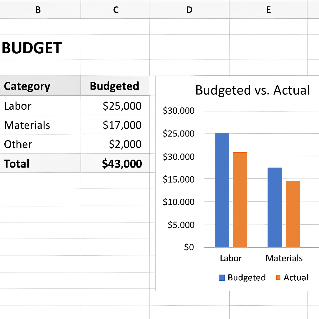
Vertex42’s project budget template shows exactly how to lay out those columns and even includes a subtotal row that rolls up by category, so you can see at a glance whether labor or materials are the biggest surprise.Vertex42’s project budget template
Visualize the numbers
A simple stacked column chart can compare budgeted versus actual costs by month or by category. Pull the subtotal rows into a small table, select it, and insert a “Clustered Column” chart. Turn the “Actual” series a bold color and the “Budget” series a lighter shade – now you have a dashboard that anyone can read in a meeting.
Smartsheet’s collection of cost‑management templates also recommends this visual approach and even provides a ready‑made layout you can copy into Excel for fast results.Smartsheet cost‑management templates
Keep it tidy with a checklist
- Create a “Budget” sheet with columns: Task ID, Cost Category, Description, Qty, Unit Rate, Budgeted Amount, Actual Amount, Variance.
- Link each row to the corresponding task using VLOOKUP or INDEX/MATCH.
- Add a subtotal row for each category (SUMIF).
- Apply conditional formatting to flag variances > 0.
- Build a small chart that contrasts budget vs. actual.
- Refresh the sheet weekly and note any overruns in your project status update.
And remember, the budget isn’t a static document – it’s a living part of your project plan template excel. Treat it like you would a Gantt bar: update it as soon as new numbers land, and the rest of the sheet stays in sync.
Give these steps a try on your next project and you’ll see the anxiety around “will we run out of money?” melt away, replaced by a clear, data‑driven picture you can share with stakeholders in minutes.
Step 5: Add Dashboard and Reporting Features
Alright, you’ve already got tasks, dates, owners, and a budget humming away. What’s the next thing that makes your heart skip a beat? Seeing everything at a glance – a dashboard that tells you, “Hey, we’re on track,” or “Whoa, that cost line just spiked.”
Why a dashboard matters
Because a spreadsheet is only as good as the story it tells. When you open a sheet and instantly see a progress bar, a spend‑vs‑budget chart, and a list of overdue items, you stop scrolling forever and start acting. It’s the difference between “I think we’re okay” and “We need to re‑allocate resources right now.”
Most teams end up scrolling through rows, manually tallying numbers, and then wondering why decisions take forever. A well‑crafted dashboard eliminates that friction.
Lay the foundation: a clean data source
Start by making sure every metric you want to display lives on a single, tidy table. Grab a new tab called DashboardData and pull in these columns:
- Task ID, Status, % Complete (from your task sheet)
- Owner, Phase (so you can slice by department)
- Budgeted Amount, Actual Amount, Variance (from the budget sheet)
- Milestone Name, Milestone Date, Milestone Status
Use simple formulas – =VLOOKUP or =INDEX/MATCH – to pull the numbers. Keep the formulas consistent so you can drag them down as you add rows. No macros, just plain Excel.
Does this feel like extra work? It’s a one‑time setup that pays off every time you open the file.
Build the visual pieces
Now the fun part: charts and gauges. Here are three quick visuals that give you a 30‑second health check.
- Overall Progress Doughnut – Use a doughnut chart that shows the sum of % Complete across all tasks divided by the total number of tasks. Plug the formula =SUM(TaskSheet!E:E)/COUNTA(TaskSheet!A:A) into a single cell and point the chart there.
- Spend vs. Budget Bar – Pull the total Budgeted and Actual amounts onto the dashboard tab, then insert a clustered column chart. Color the Budget bar light gray, the Actual bar a bold teal. Add a data label that shows the variance percentage.
- Milestone Tracker – Insert a scatter chart with Milestone Date on the X‑axis and a dummy Y value (just use 1 for every point). Turn on data labels to show the Milestone Name. Conditional formatting can turn the label red if the milestone is past due and still “Planned”.
All three charts will automatically update whenever you add a new task or log a new expense – that’s the magic of linking them to the DashboardData table.
Quick checklist for a live dashboard
- Create a dedicated DashboardData tab that consolidates key metrics.
- Use VLOOKUP/INDEX‑MATCH to pull values – keep formulas simple.
- Insert a doughnut for overall % complete.
- Add a clustered column for budget vs. actual spend.
- Set up a scatter chart for milestones with conditional formatting for overdue items.
- Place all three charts on a single Dashboard sheet, add a title, and leave a few blank rows for future widgets.
Once you’ve arranged the charts, give the sheet a clean look: hide gridlines, use a consistent color palette (the same teal you use for “In Progress” elsewhere), and add a tiny text box that says “Last refreshed: ” & TEXT(NOW(),”mm/dd/yyyy hh:mm”). That tiny note reassures anyone opening the file that the numbers are fresh.
Make it interactive
Want to let stakeholders filter by phase or owner without digging into the raw data? Add a slicer linked to a pivot table that summarizes % Complete and spend per phase. The slicer sits right above the charts, and clicking “Marketing” instantly updates the doughnut and bar chart to show only marketing‑related work.
If you’re comfortable with a bit of Excel magic, you can also use the GETPIVOTDATA function to pull specific numbers into custom text boxes – for example, “We’re $2,300 under budget for the Development phase”.
Pro tip: reuse a template
Plaky’s free Excel dashboard template shows exactly how to structure these pieces and even includes a ready‑made slicer setup. Grab it, swap out the sample data with your own, and you’ve got a polished reporting sheet in minutes. Plaky’s dashboard guide walks you through each step.
And that’s it – a dashboard that updates itself, tells the story of your project, and saves you from endless email updates. Next time you need to show senior leadership how the project is doing, you’ll just click the Dashboard tab and let the charts do the talking.
Conclusion
We’ve walked through every piece of a solid project plan template excel, from setting crystal‑clear goals to wiring up a live dashboard that talks for you.
By now you probably feel that familiar mix of relief and excitement you get when a messy spreadsheet finally starts making sense.
Remember, the magic lives in the little habits: keep your goal table up to date, let the slicer filter your view, and glance at the variance colors before your next status call.
So, what’s the next step? Grab the template you built, save a master copy in OneDrive, and treat each new project as a clone that you tweak, not a brand‑new blank sheet.
When you update the % Complete or plug in a new expense, the charts shift on their own – no macro, no hassle, just pure Excel power.
And if you ever hit a roadblock, think back to the capacity check we added: a quick red flash tells you when someone’s overloaded, saving you from that dreaded “who’s doing what?” email thread.
In short, a well‑designed project plan template excel turns chaos into clarity, keeps stakeholders in the loop, and frees you up to focus on the work that really matters.
Give it a spin on your next initiative, tweak the colors to match your brand, and watch the confidence level in your team rise. Happy planning!
FAQ
What is a project plan template excel and why should I use one?
At its core, a project plan template excel is a pre‑structured workbook that holds all the pieces you need to run a project—tasks, dates, owners, milestones, and even budget rows. Because everything lives in one file, you can see how a delay in one task ripples through the schedule, and you avoid the endless email chains that happen when people keep separate lists. It’s basically a living command center you can share with anyone who has Excel.
How do I set up a basic project plan template in Excel?
Start by creating a sheet called Tasks. List each activity in column A, then add columns for Owner, Start Date, Duration (in days) and an End Date formula like =WORKDAY(C2,D2‑1). Add a Status drop‑down so you can flag Not Started, In Progress or Complete. Once the table is in place, insert a stacked‑bar chart, hide the start series, and let the duration series become your Gantt bars. A few clicks and you’ve got a visual timeline that updates whenever you change a date.
Can I track task progress and % complete automatically?
Yes—you can let Excel calculate % Complete for you. Add a column called % Complete and use a simple IF formula: =IF(Status=”Complete”,100,IF(Status=”In Progress”,50,0)). For more granularity, tie the percentage to a numeric progress field that you update as work advances. Then feed that column into a doughnut or progress‑bar chart on your Dashboard sheet, and you’ll see a live visual cue of how much work is really done.
How do I manage resource allocation and avoid overallocation?
Resource allocation lives in a hidden Capacity sheet. List each team member, their weekly hours, and then pull the total assigned hours from the Tasks table with a SUMIF. If the sum exceeds the capacity cell, apply conditional formatting that flashes red—your spreadsheet’s gentle reminder that someone’s overloaded. Because the formula is live, moving a task from one owner to another instantly re‑balances the load without any manual recalculation.
What budgeting and cost‑tracking features can I add without macros?
You don’t need VBA to track money—just a few columns and some simple math. In a Budget tab, create rows for each cost bucket (labor, materials, software, etc.) and pull the estimated hours and rate from the Resources sheet with VLOOKUP or INDEX/MATCH. Multiply them for the labor cost, add any fixed fees, and you have a budgeted amount. Then add an Actual column where you paste invoices, and a Variance column that flags overruns with red formatting.
How can I turn my data into a live dashboard that updates itself?
The easiest way to get a live dashboard is to funnel the key numbers onto a single DashboardData sheet. Pull % Complete, total budget, actual spend, and milestone dates with VLOOKUP or simple references. Then drop a doughnut for overall progress, a clustered column for budget vs. actual, and a scatter chart for milestones onto a Dashboard sheet. Add a slicer linked to a pivot that summarizes by phase or owner, and you’ve got an interactive view that updates the moment you type a new value.
What are the most common mistakes people make with a project plan template excel?
One trap is treating the template like a static list and never updating it; the moment you stop entering % Complete or new expenses the dashboard becomes stale. Another common slip is over‑complicating formulas—nesting three VLOOKUPs in one cell makes debugging a nightmare. Finally, many users forget to lock the file in OneDrive or SharePoint, so colleagues end up working on separate copies and overwrite each other’s changes. Keep it simple, refresh daily, and store the master in the cloud.
Deep Dive: Customizing Your Excel Project Plan Template
By now you’ve got a basic timeline, resources, and a budget humming in your spreadsheet. The next step is to make that workbook feel like it was built for your specific project, not a generic copy‑paste.
Swap in columns that matter to you
Take a look at the default columns – Owner, Start Date, Duration, Status. Ask yourself, “What does my team actually track every day?” Maybe you need a Risk Level column, a Client Approval flag, or a quick Notes field for ad‑hoc comments.
Just add a new column next to the task table, give it a clear header, and use data‑validation lists for consistency. Because the Gantt chart reads the Start Date and Duration columns, the extra fields won’t break the visual – they’ll simply sit there for you to filter or pivot later.
Tailor the Gantt chart to your workflow
Excel ships with a handful of free Gantt chart templates in Excel that already hide the start‑date series and color the duration bars. Grab one, paste it into your sheet, then replace the sample data with your own task table.
Once the data is linked, you can change the bar colors to match your phase naming (Planning = teal, Development = orange, Launch = green). Use the chart’s Format Data Series pane to set “No Fill” on the start series – that’s what makes the bars appear to start at the right date without a visible offset.
Need to show progress inside each bar? Add a % Complete column and overlay a thin line series that stretches only to the percent value. It looks like a tiny progress marker riding along the bar, and it updates automatically as you tweak the percentage.
Highlight risk and overdue items with conditional formatting
One of the easiest ways to make the plan scream “attention needed” is to color‑code cells based on rules. For example, set a rule that turns the Risk Level cell red when it reads “High”. Or, create a rule on the End Date column that shades the cell orange if the date is past today and the Status isn’t “Complete”.
Because conditional formatting lives on the worksheet, the same colors appear in the Gantt chart if you bind the bar fill to the same cell value via a linked Color column. That way a red risk bar instantly tells you where the trouble spot is.
Use named ranges for repeatable formulas
When you start copying the template for a new project, you’ll thank yourself for turning key ranges into names. Highlight the whole task table (including the header row) and hit Formulas → Define Name. Call it Tasks. Now any VLOOKUP or INDEX/MATCH can refer to Tasks instead of a hard‑coded cell address.
Named ranges also make it simple to pull totals onto a dashboard. A formula like =SUMIFS(Tasks[Budgeted],Tasks[Phase],"Development") will always point to the right column, even if you later insert new columns or move the table around.
Add a lightweight dashboard tab
If you’re already tracking % Complete, budget vs. actual, and milestone dates, you can pull those three numbers onto a single “Dashboard” sheet with a few simple formulas. A doughnut chart for overall progress, a clustered column for budget vs. actual, and a scatter chart for upcoming milestones give stakeholders a quick visual without opening the raw tables.
Tip: hide the gridlines on the Dashboard sheet, use the same teal you use for “In Progress”, and add a tiny text box that reads “Last refreshed: ” & TEXT(NOW(),”mm/dd/yyyy hh:mm”). It reassures anyone opening the file that the data is current.
Quick customization checklist
- Add any extra columns your team actually uses (Risk, Approval, Notes).
- Swap the default Gantt chart with a free template and link it to your task table.
- Apply conditional formatting for high‑risk or overdue rows.
- Define named ranges for the task table and any lookup tables.
- Build a one‑page dashboard with progress, budget, and milestone visuals.
- Save the workbook as a master copy in OneDrive, then clone it for each new project.
All of these tweaks keep the spreadsheet feeling personal, keep the data live, and make sure you’re not spending hours hunting for a missing column or re‑creating a chart from scratch. The more you shape the template to your own language and flow, the less the tool feels like a constraint and the more it becomes a reliable sidekick for every project you run.